Webbutveckling • Webbdesign • Visuell identitet
Vogelzang
2023 | Belgium, Brussels
Kund
Vogelzang is a Center for Integral Family Care, where young children and their (future) parents are supervised. The organisation supports families in difficult parenting situations who need extra psychological and childcare support.
Utmaning
Vogelzang did not have a website and lacked consistent branding to follow in communication with other associations and individuals. Vogelzang needed support in establishing an online presence by creating a platform to convey its mission and goals and provide information about its services.
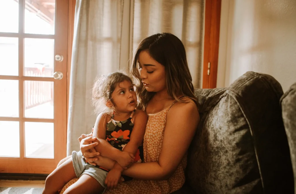

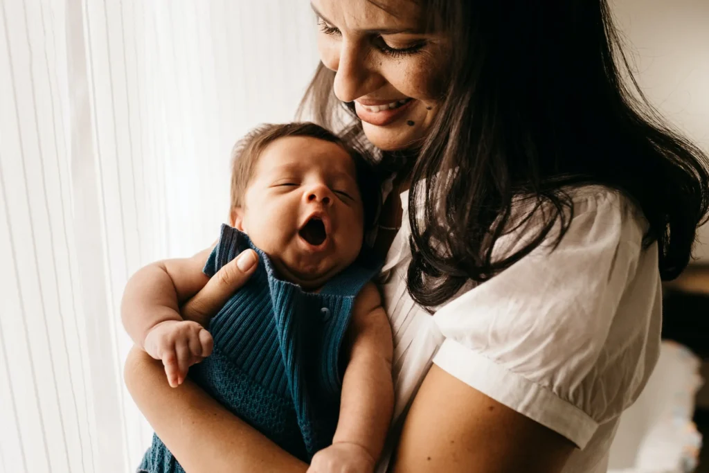
Website
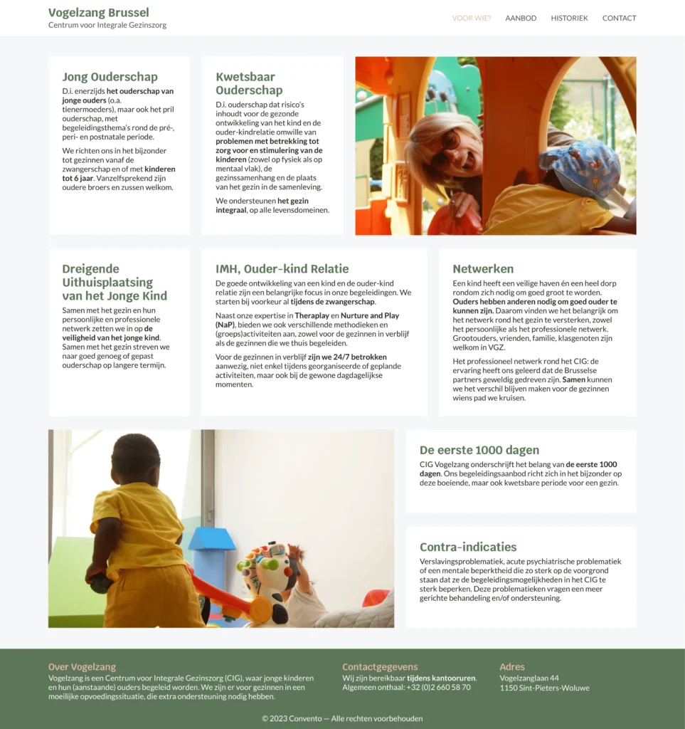
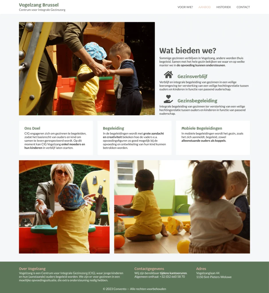
The goal was to create a simple website for Vogelzang to present and communicate their initiative, offering and motivations. It primarily serves an informational purpose, where all details are easily accessible. To facilitate these needs, we created a website with five pages, a clear navigation bar and a footer.
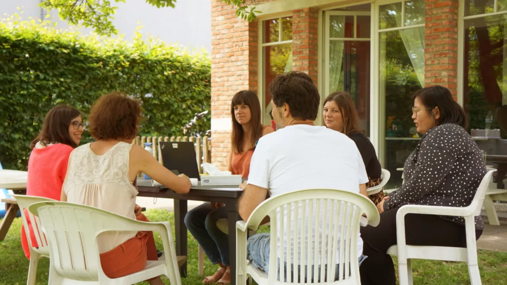
Hemsida
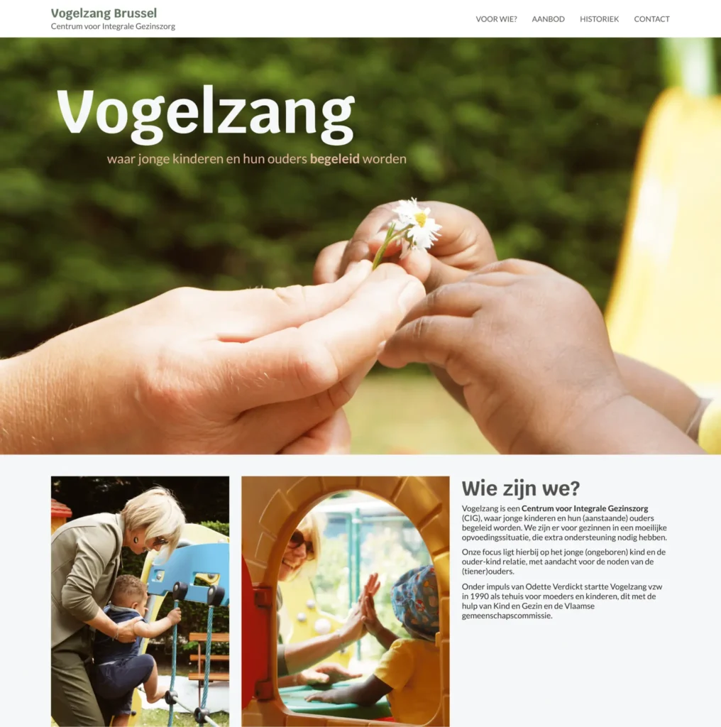
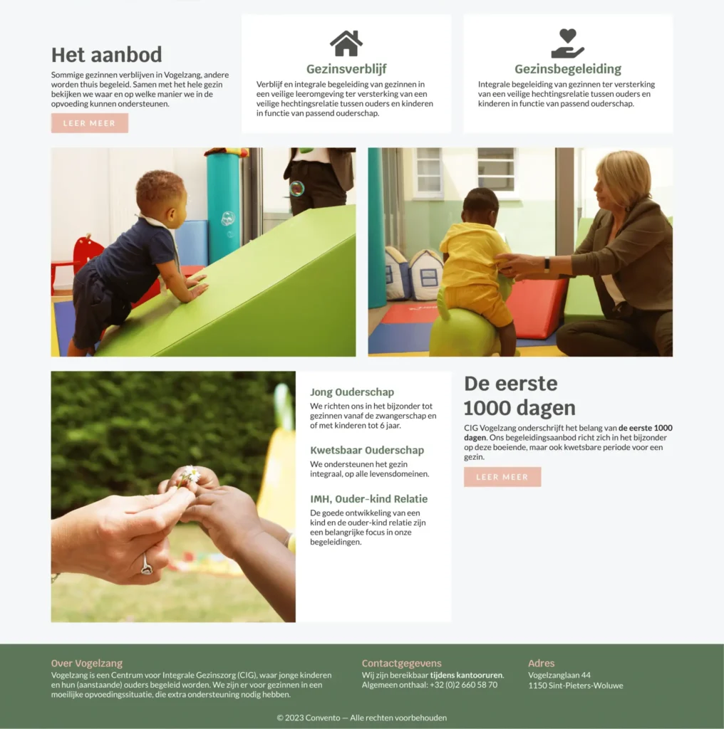
The homepage is designed in such a way that visitors can learn basic information about Vogelzang in a single location. The user gets to know the mission of Vogelzang, the programmes and the support options. The page is full of bright colours and images, inviting visitors to explore the website further.
Visuell identitet
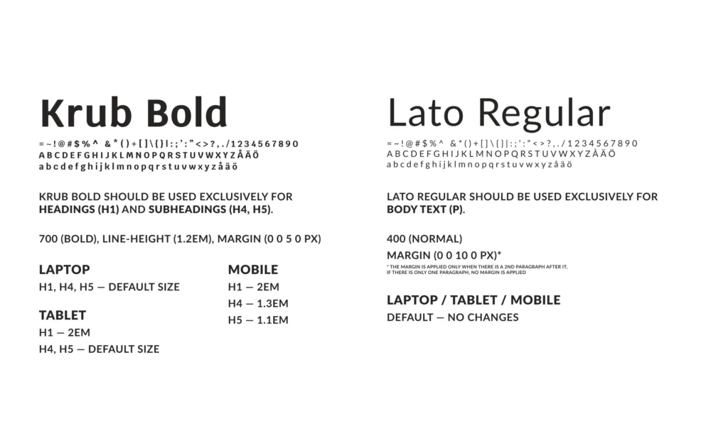
Vogelzang did not have a proper visual strategy in mind and relied on the guides from the external venue they would be a part of in the future. Since Vogelzang relies strongly on external communication, we made a choice to create a unique and original visual identity for Vogelzang that aligns with the organisation’s values.
Färger
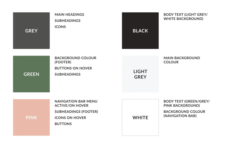
With the new version of the colour palette, we dropped the idea of primary and secondary colours. We narrowed the selection to six shades, including black, light grey and white, which are to be used exclusively for body text and background. Next to those, there are dark grey, green and pink. The core colours are grey, green and pink, which convey neutrality, growth and femininity.

Responsive
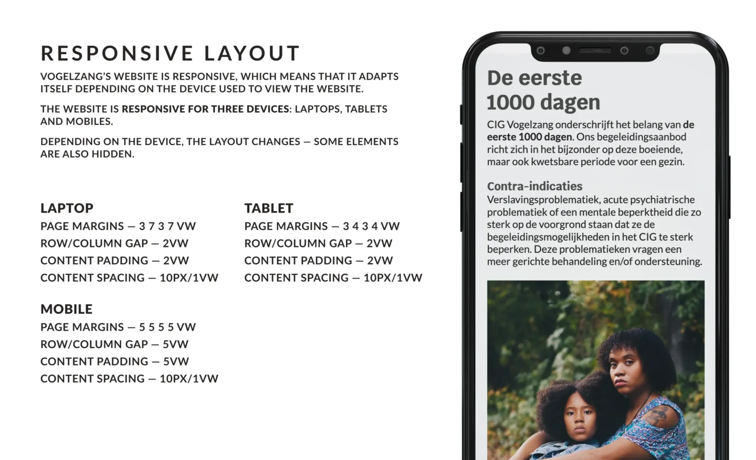
For a dynamic organisation like Vogelzang, their communication must be accessible and straightforward. Therefore, we ensured the website is supported on all devices, including desktops, laptops, tablets and mobile phones. The organisation received straightforward guidelines on editing pages and content in line with the responsive layout.
Slutsats
The website is now handed over to Vogelzang, and they are responsible for adding new content in line with our design. Prior to handover, we held an online tutoring session where we taught three Vogelzang employees how to edit the website and add new content.
