Web Design • User Experience
Merit Democracy
2023 | Denmark, Copenhagen
Kund
Erdem Ovacik is a public innovator and entrepreneur with over a decade of experience in cross-sector collaboration. Passionate about enhancing the ability to deliver better public governance and services with data and market-driven innovation, he embarked on a journey of crafting Merit Democracy [source].
Utmaning
Merit Democracy is a collective decision-making process and organisation where participants bet on the future outcomes of proposals and get rewarded if the proposals succeed and solve a collectively pre-agreed problem [source]. Erdem needed our help in delivering a prototype for the Merit Democracy web application that would facilitate all four stages of the model.
Project collaborators: Victor Kristensen, Liam De Vidts, Óscar Manzaneda López, Sophia Aurora Naggi.
Hemsida
The entire work for Merit Democracy happened on Figma, where we delivered the UX prototype of the web application. The first step of the process was to design a homepage that sheds light on the complex processes of Merit Democracy and explains all four steps of the model.

Model
The Merit Democracy model consists of four stages. Each one of these stages is equally important in the process and needs to be simplified as much as possible for the users to comprehend.
For example, in the first stage, Aggregating Priority Challenges, the citizens and stakeholders can collaboratively identify, aggregate, and prioritise the most pressing challenges facing their community. Our mission was to create a layout for this stage that is easy to grasp, informative and not misleading.
Login and Sign Up
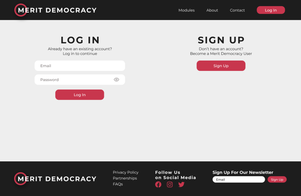
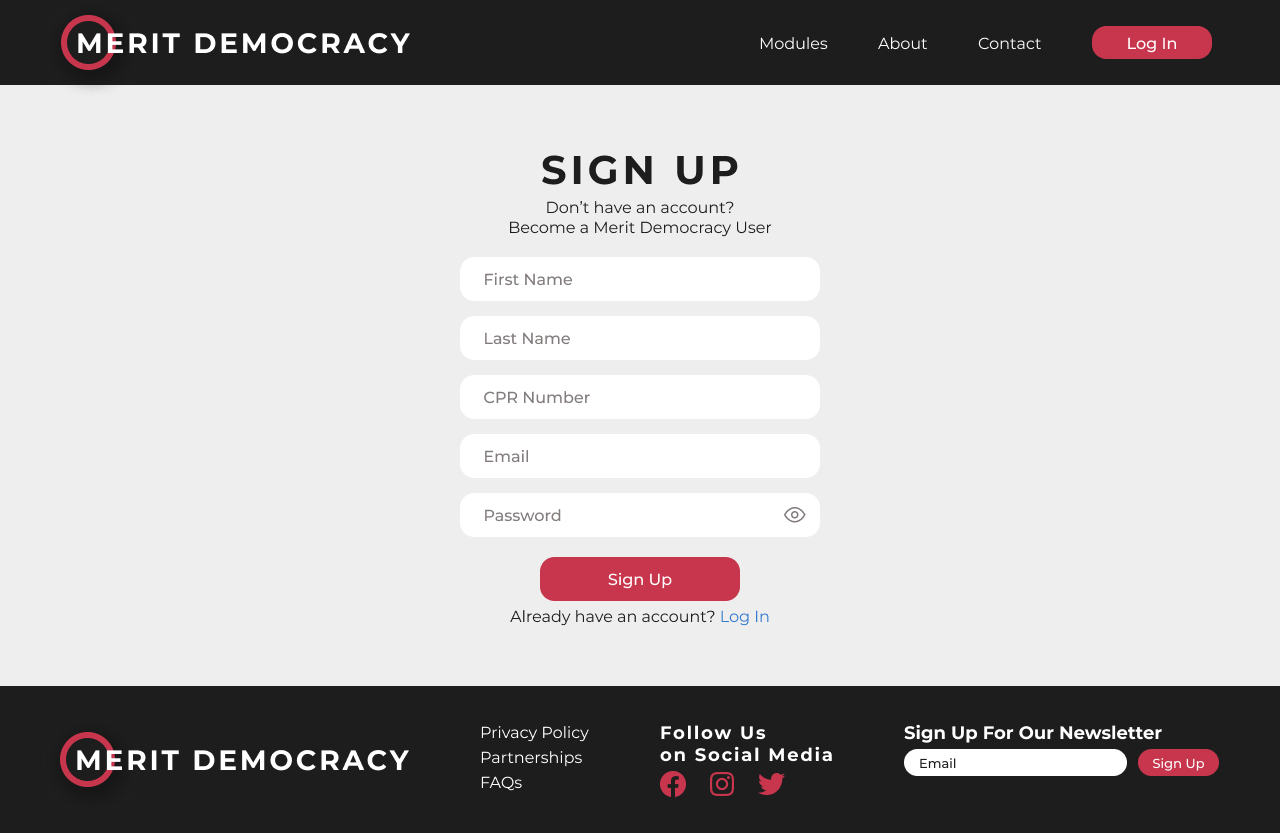
To use the full potential of the web application, users need to create accounts verified with their CPR numbers. Therefore, the application is only available to Danish citizens. That is to avoid false proposals. The non-logged-in visitors can still access the website to learn more about the initiative and the founder and contact the responsible.


Navbar
The web application includes features that are access-restrained only for logged-in users. Therefore, we needed to design two navigation bars that would change depending on the user status. Non-logged-in users have access to Modules, About and Contact pages. On the other hand, the logged-in users can view their Challenges, Proposals, Profile and Settings.
Footer
The footer remains the same for logged-in and non-logged-in users and contains the most core information about the web application. There, links to pages such as Privacy Policy, Partnerships and FAQs are listed next to social media platforms, such as Facebook, Instagram and Twitter.


Profile Page
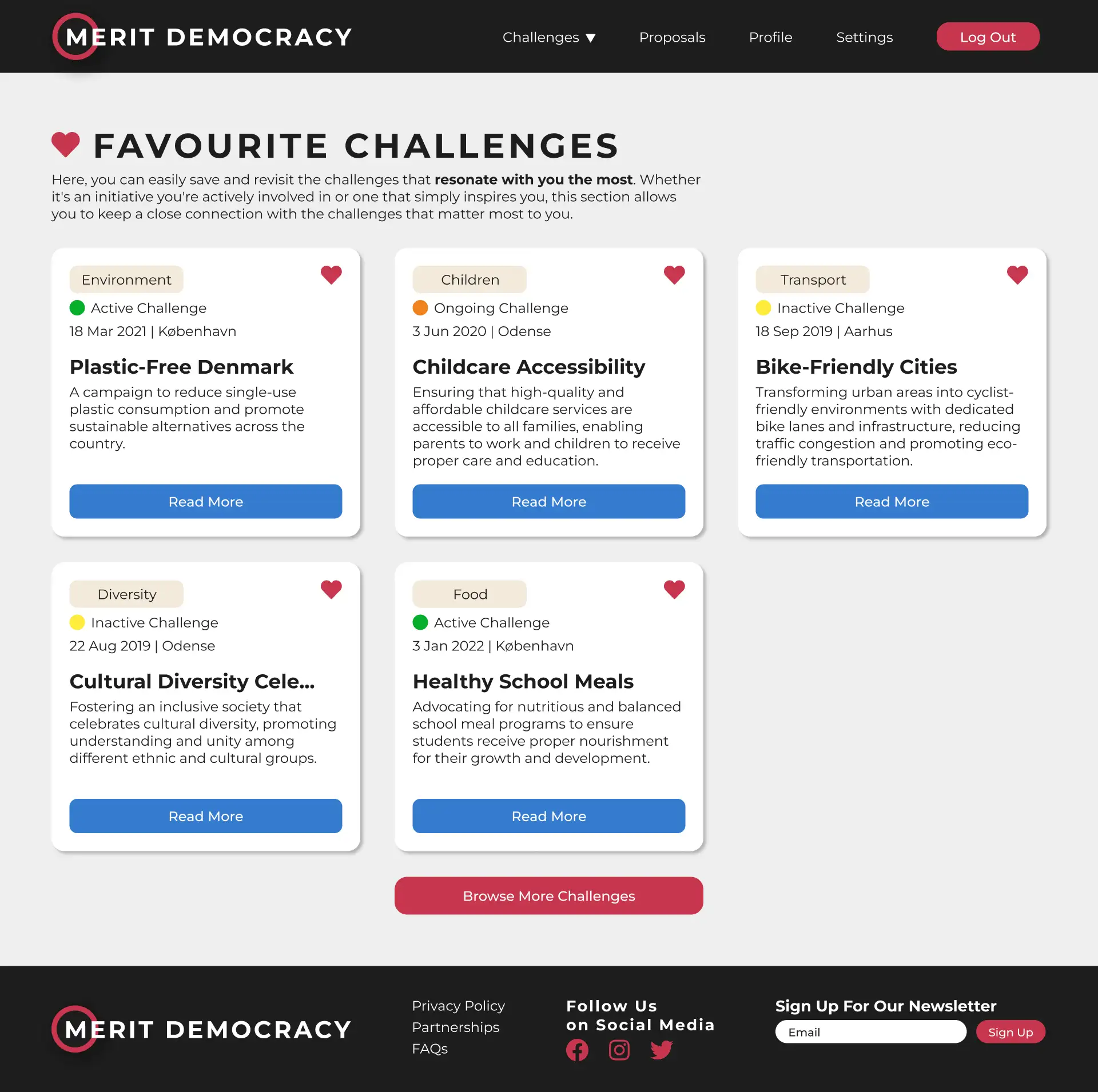
Users can access their customised profile page, set their profile image, and social media channels and browse their app activity. They have an overview of their budget assignment, favourite challenges, credit score and transaction history.

Challenges
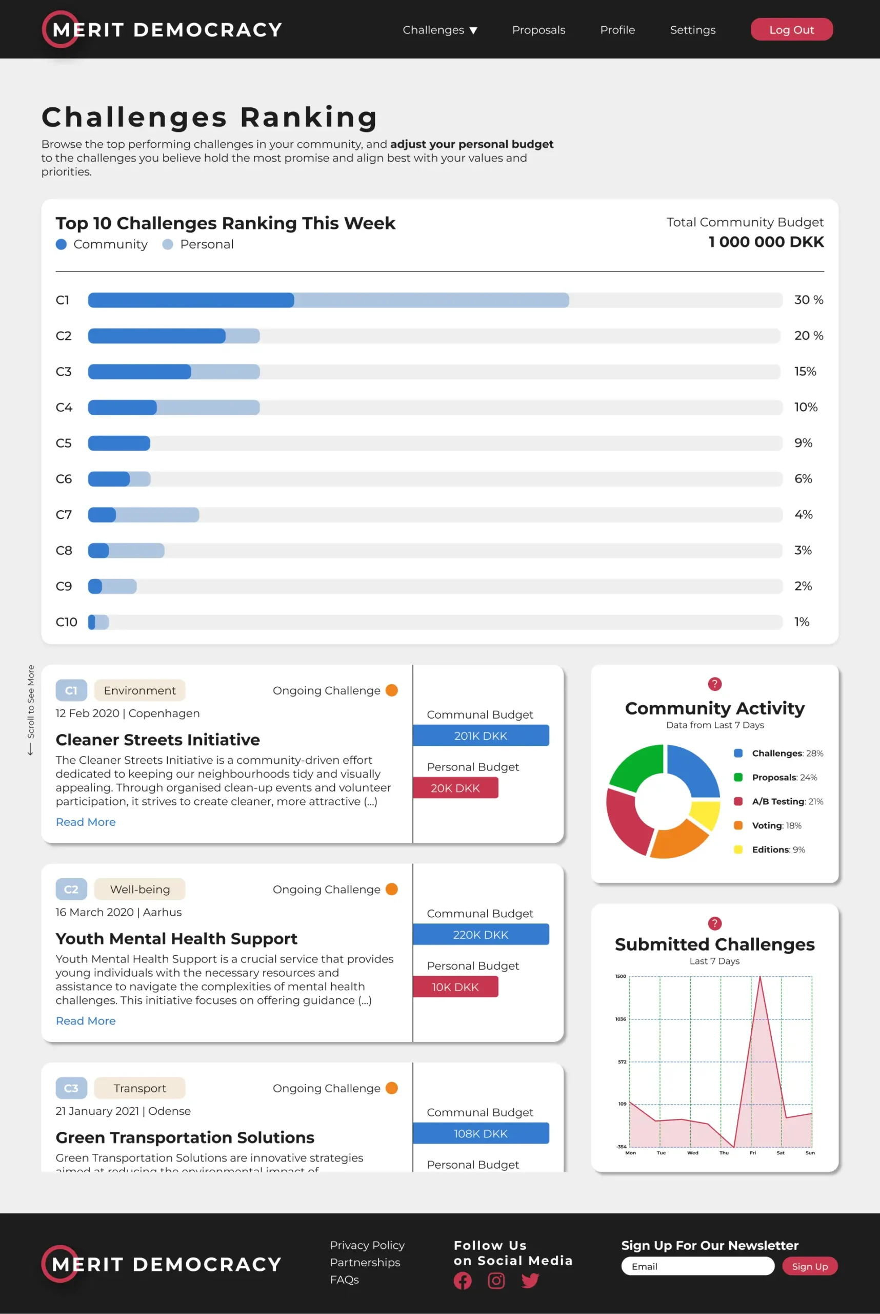
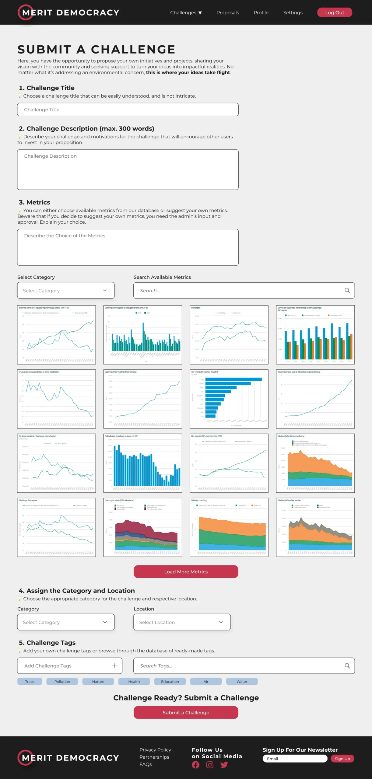
App users can submit their challenges for problems and initiatives that need action. Moreover, they have full access to the browse section where they can filter challenges by category, status, location and date added. This gives the users the possibility to stay on top of what’s happening around them in their communities and prioritise initiatives they care about.
Components
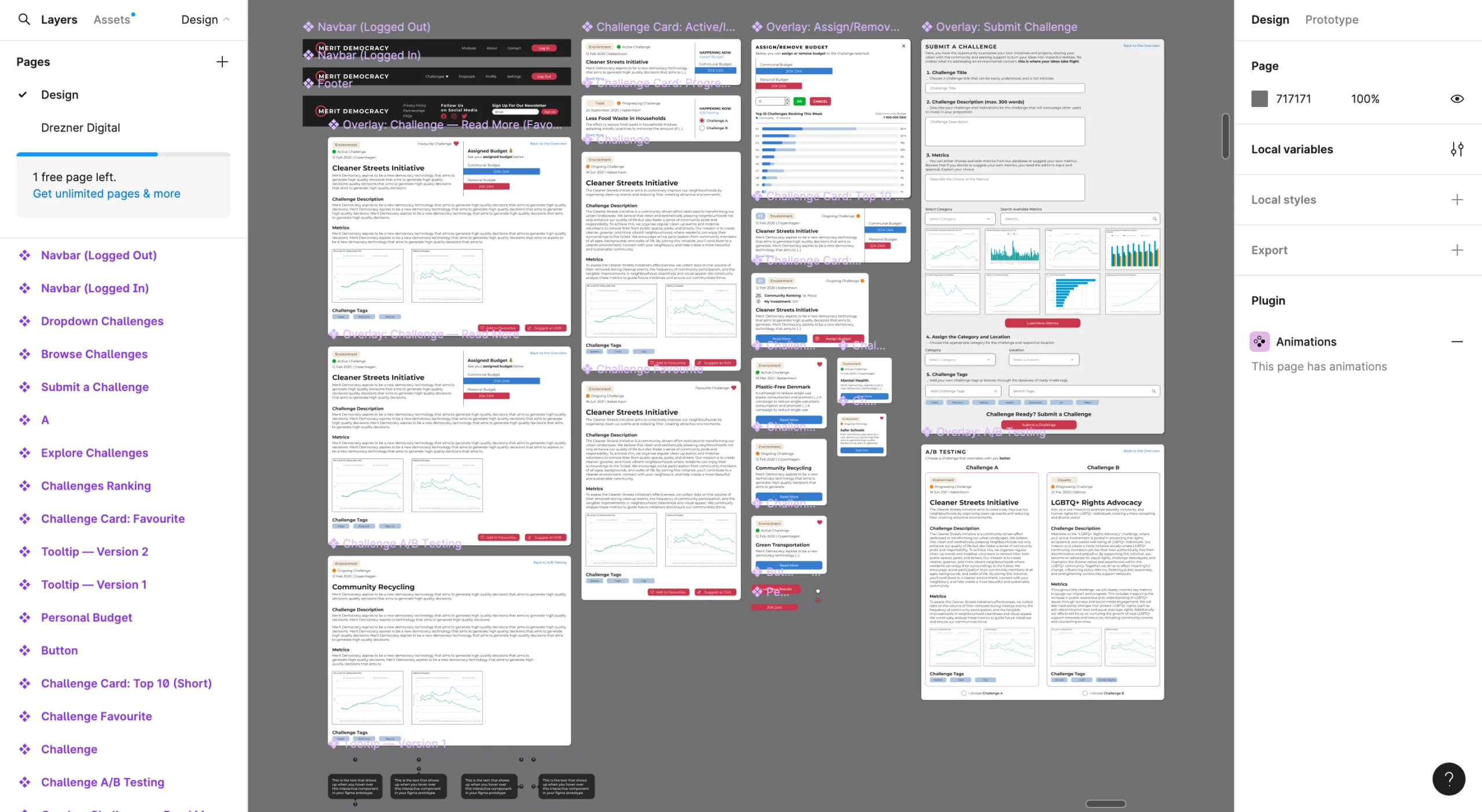
To streamline the design process, we ensured that each reusable element was created into components. This practice allowed us to keep better consistency of the web application without compromising its design and complexity.
Slutsats
The project took us four weeks, which was not enough to fully develop the prototype. Anyway, we included the first two steps of the model in the application, allowing for gathering the first insights about the idea and seeking funding. As for our understanding, the Merit Democracy initiative is currently on hold, although Erdem did begin work on a similar application.
