Web Design • Web Development • User Experience
Altyra — Rádios Multisite
2024 | Portugal, Lisbon
Client
Altyra Solutions is a Portuguese software company that was born to respond to a continuous search for services and processes in the area of information technology. Altyra asked us to collaborate on a project for their client, who owns three regional radio stations, Rádio Elvas, Nova Antena, and Campo Maior.
Challenge
The client used to manage three websites for each one of his radio stations. He was unsatisfied with such a solution and, due to a lack of resources, wanted us to develop a multisite where he could manage all his websites in one location. His websites were last updated in 2016 and needed to be redesigned, keeping the former touch but giving it a fresher look.
Multisite
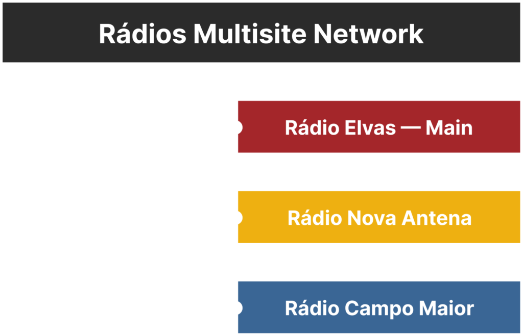
To solve the client’s need for easy web management, we developed a multisite with three subsites for each radio station: Rádio Elvas, Nova Antena, and Campo Maior. Since Rádio Elvas is the largest station of the three, we chose it to be the primary website in the network.
With the new solution, website writers and authors need to access only one site, and with correct permissions, they can publish across all three sites.
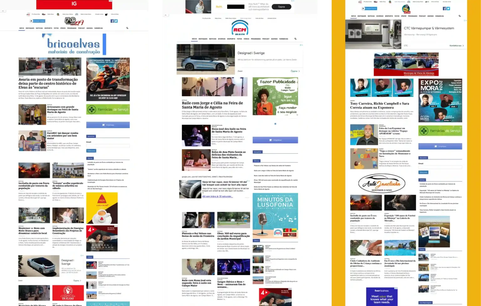
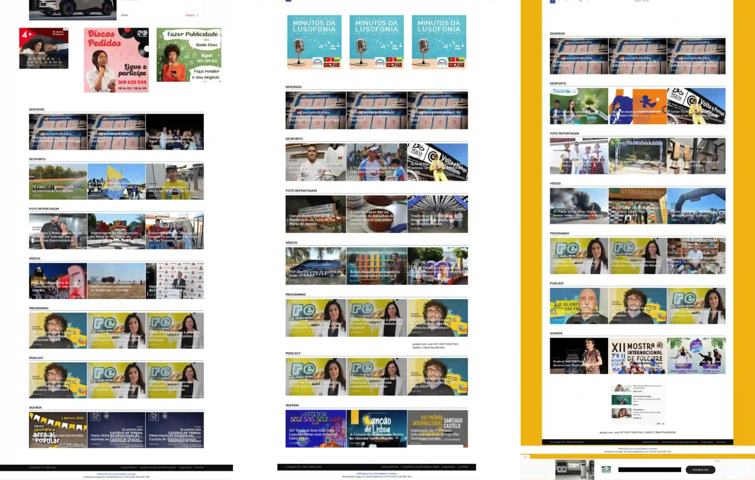
Old Design
We were asked to redesign the websites. The client was not satisfied with the old look of his websites, as they were outdated, messy and cluttered.
Having spoken to some users of the websites, we found out that they were overwhelmed with the amount of content and advertisements, while lack of order and consistency made them lost and confused.
Improvements
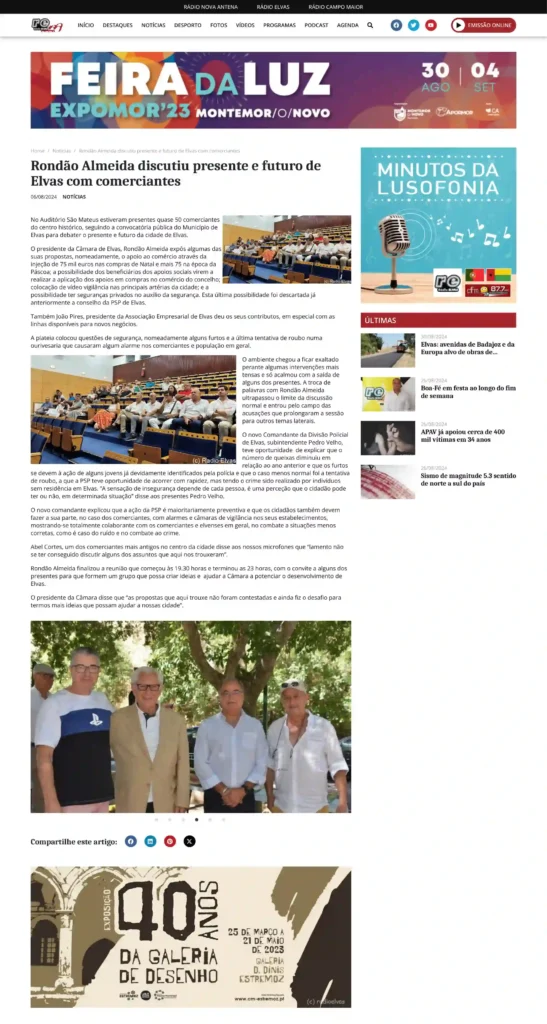
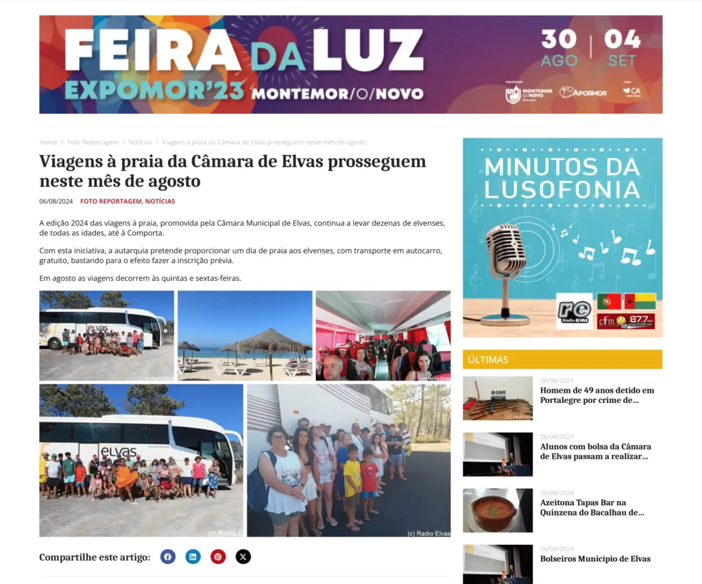
We cleaned the layout while introducing clear section breaks. The advertisements were a core problem on the former website since they appeared aggressive and discouraged users from further reading. In our solution, banners and ads are subtly incorporated into the reading flow, and the unified sizes harmoniously complement the design.
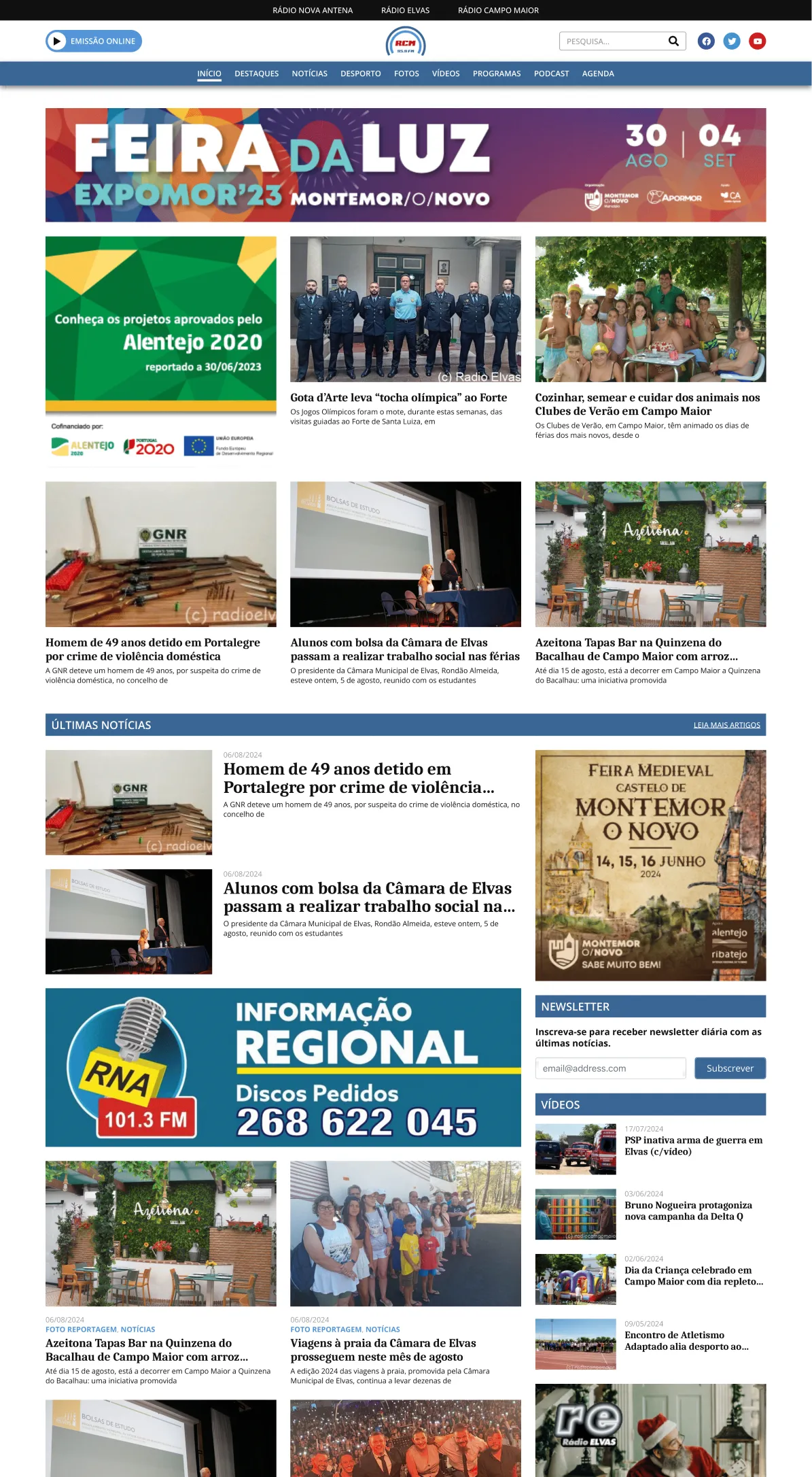
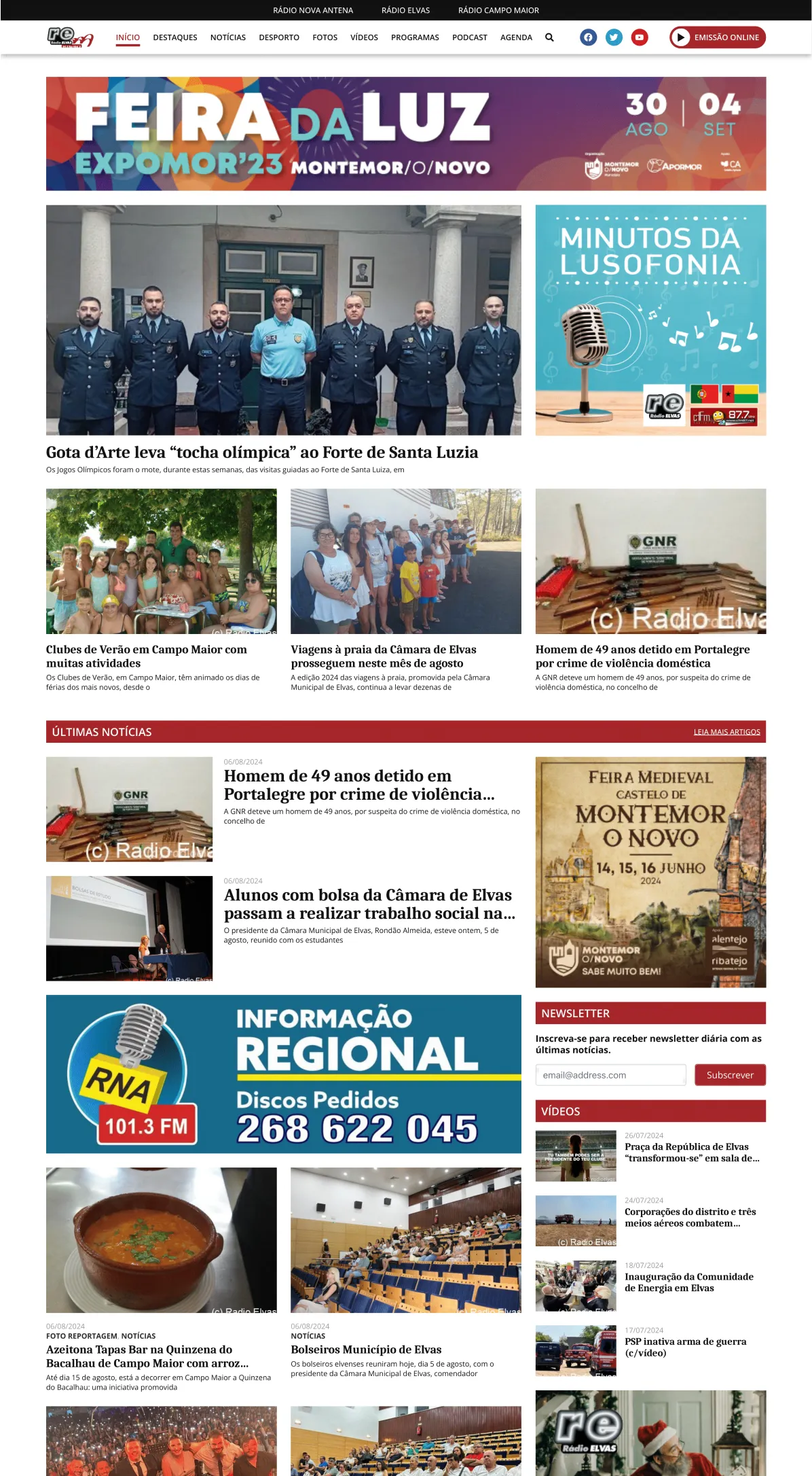
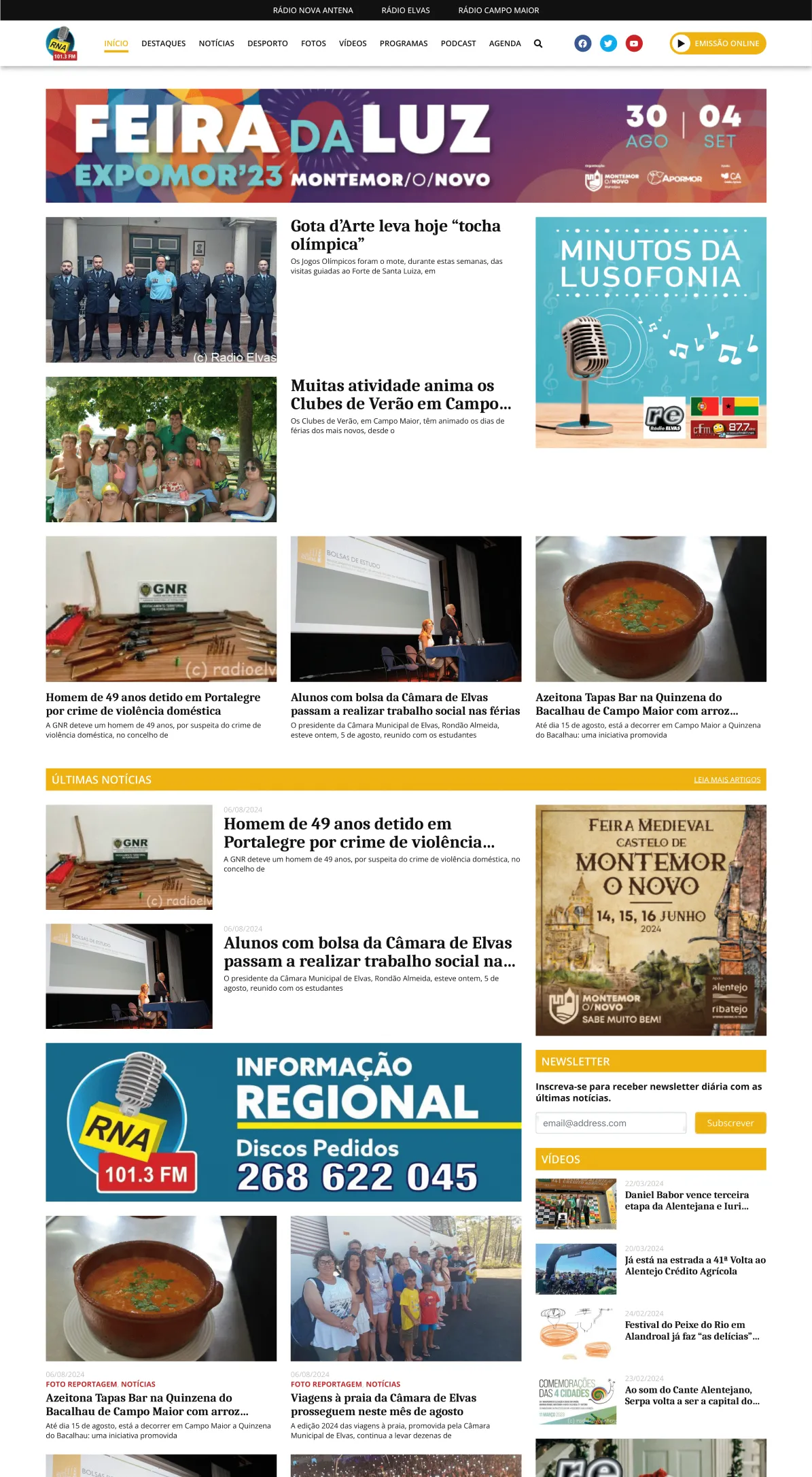
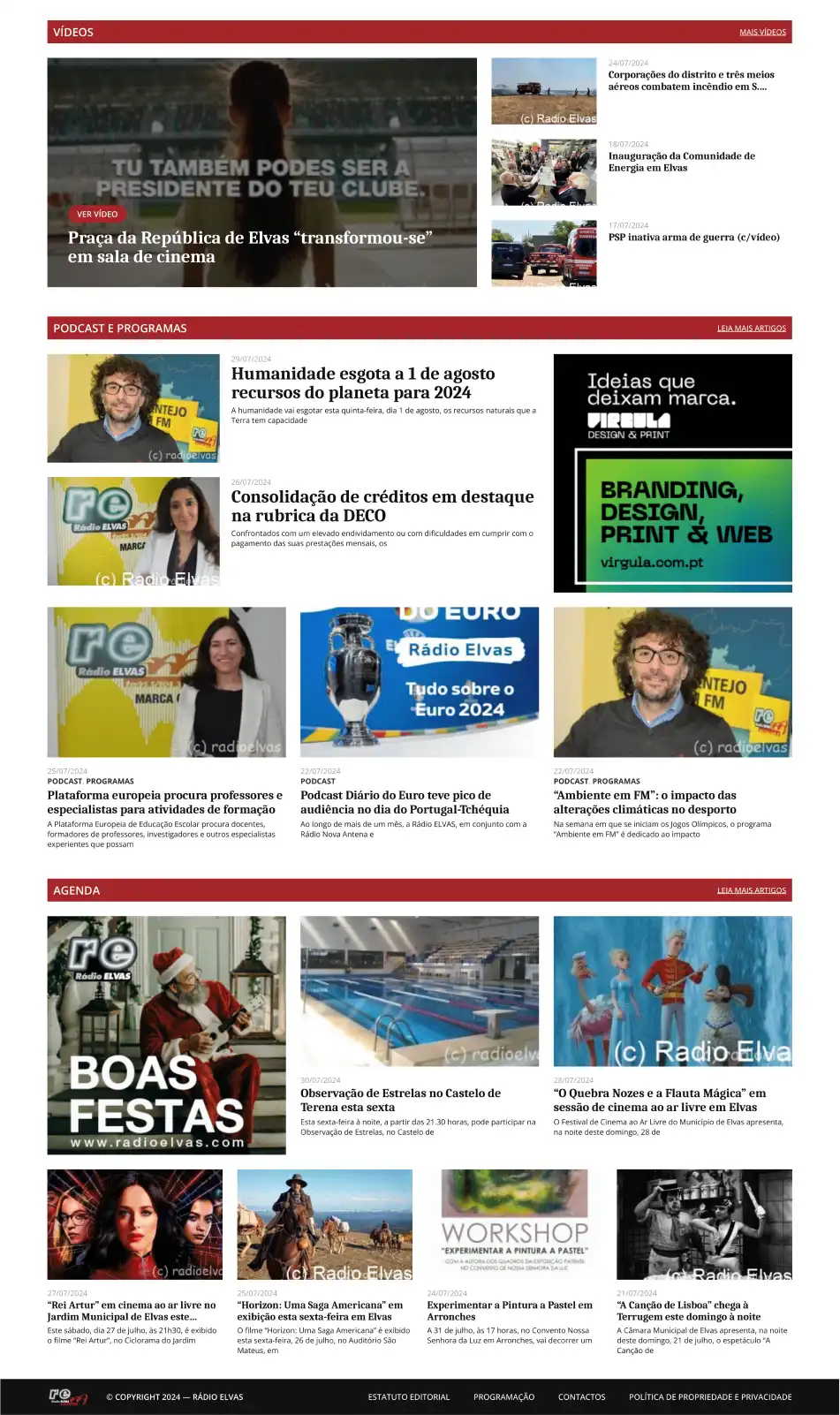
Homepage
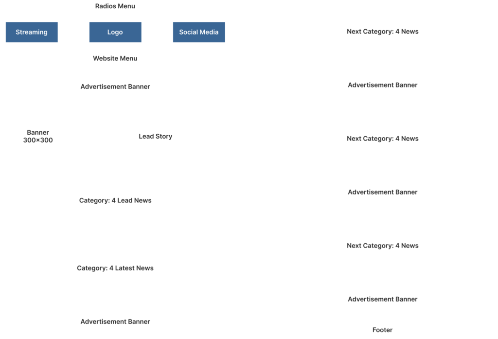
We attempted to keep the homepage as short as possible but simultaneously full of the newest and rich content. For the client, this was the most crucial page of the entire site. Therefore, he presented us with rough visualisations of how he wanted the content to be displayed—and we followed these.
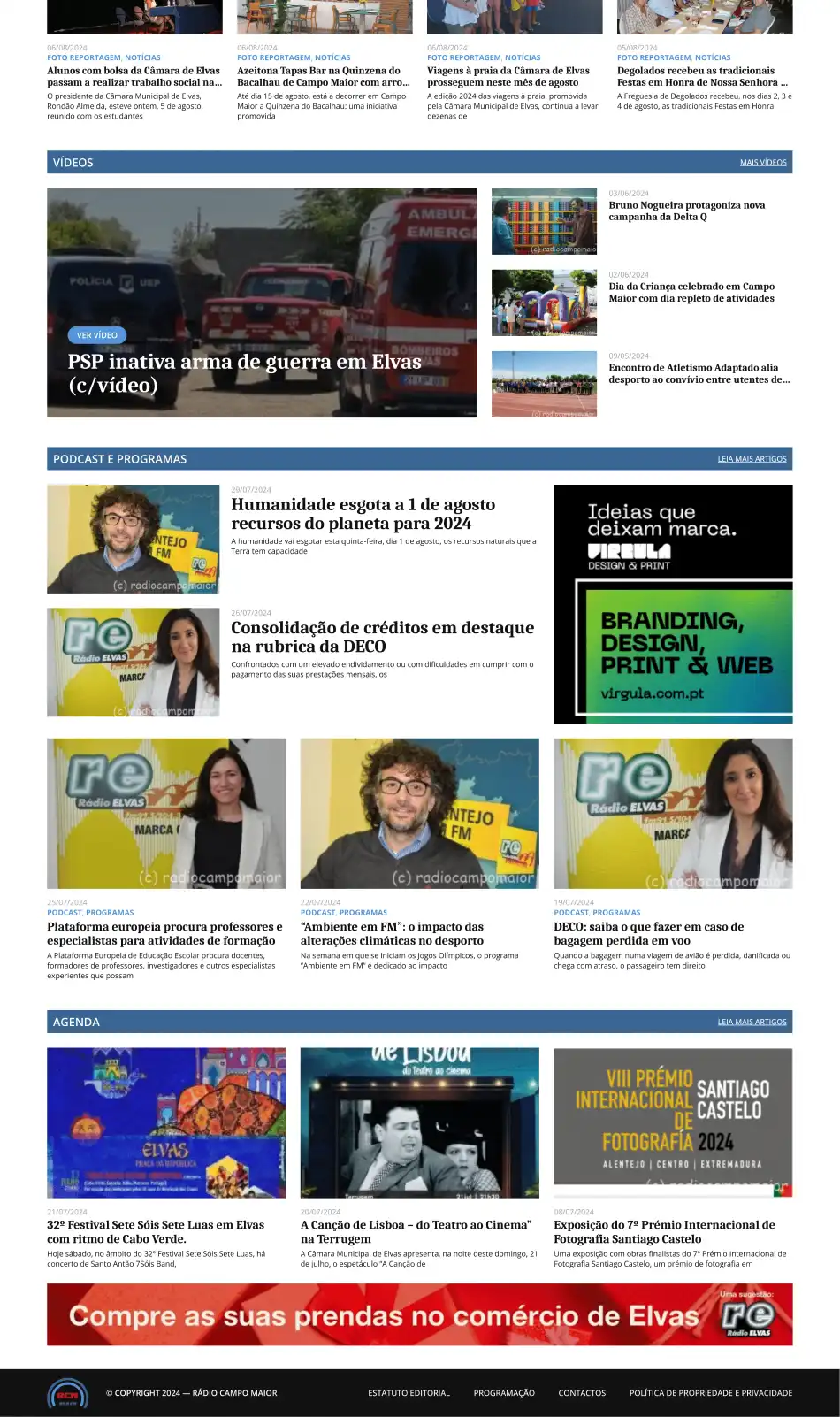
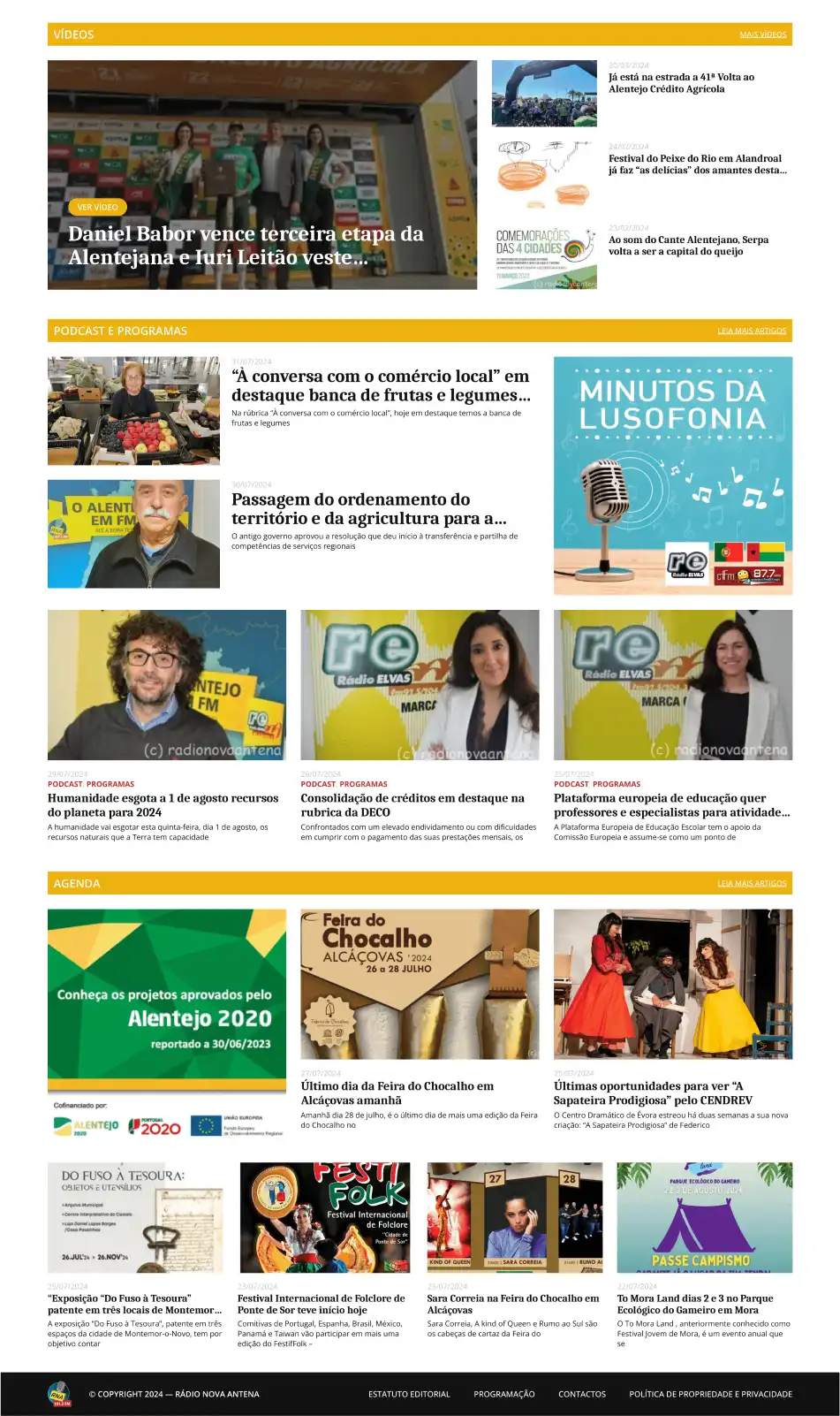
Consistency
Visual consistency was a core part of the project. Therefore, we implemented the same solutions with slight changes on all three websites. This way, the sites match visually but offer users a clear indication of which website they are viewing.
Visual Identity
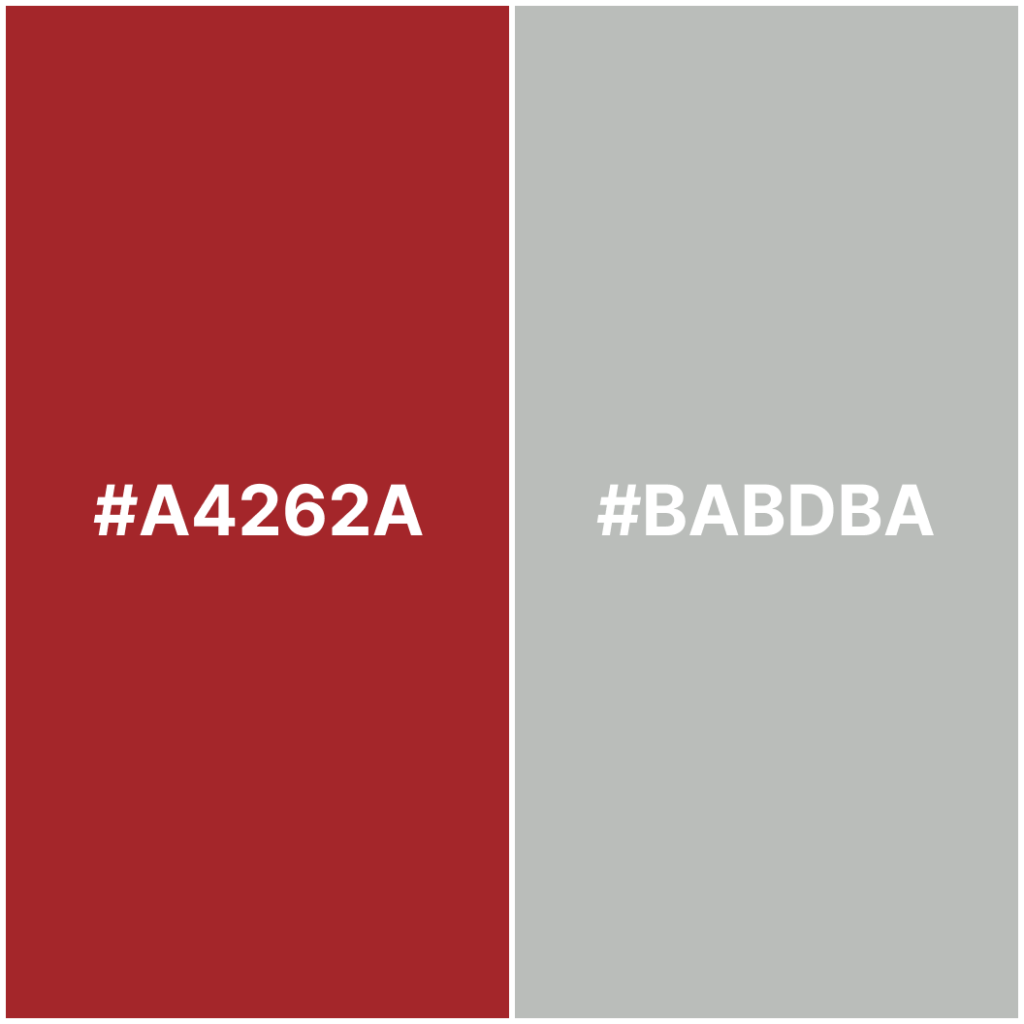
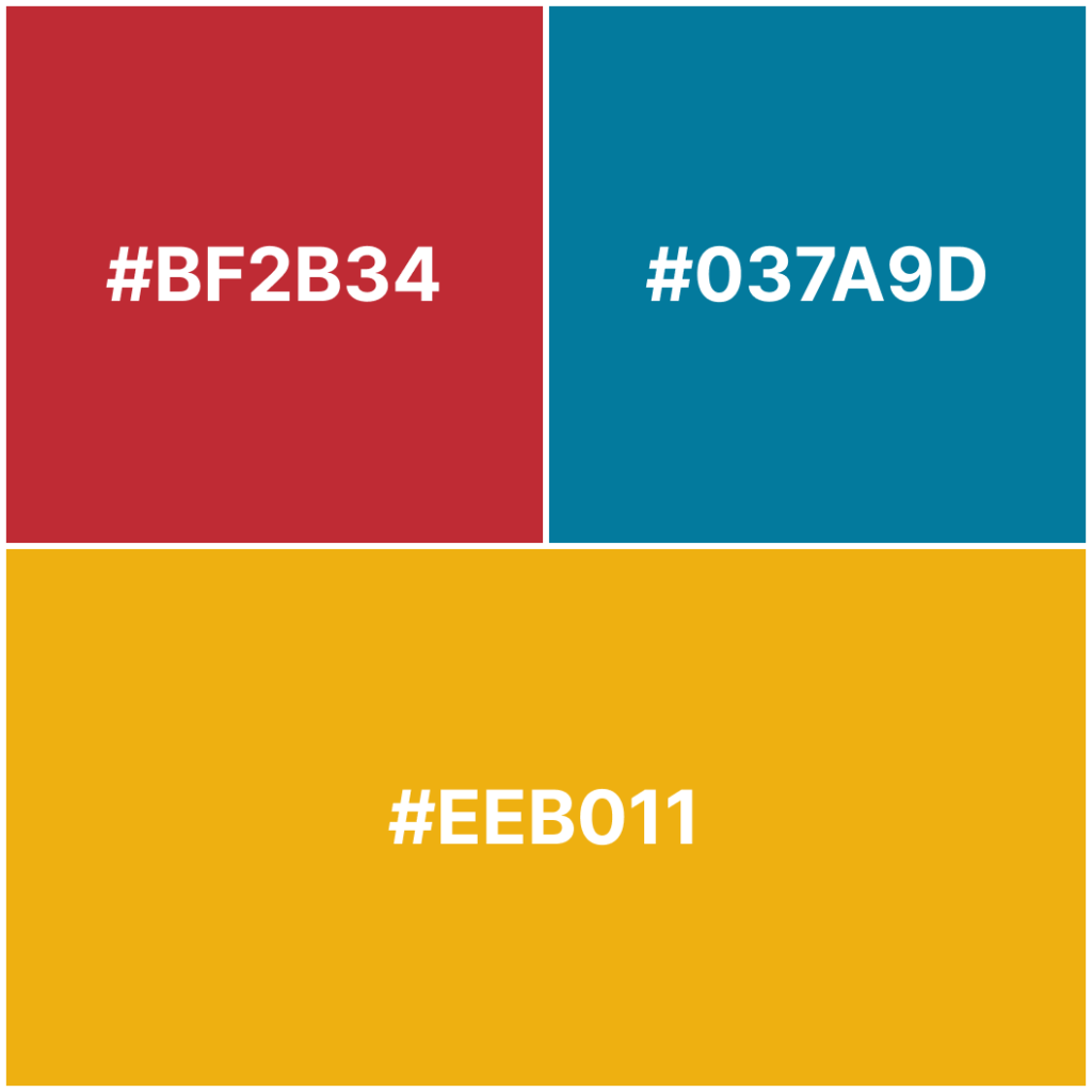
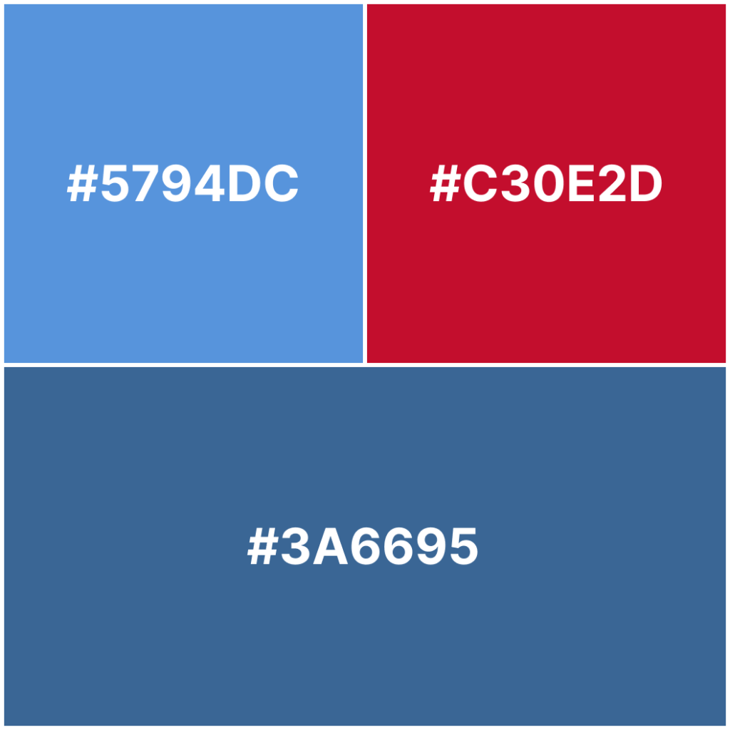
The client wanted the websites to be different from each other yet keep the unified style that “belongs” to the network. Therefore, we went for one set of fonts and colours that we used throughout all three sites.
Each website has its distinct colour palette consisting of two/three unique shades + four primary shades to be used across all three sites.

Graphical Elements
The former websites did not have any consistent visual identity in place, making it hard to make connotations. We decided to source the ideas for the visual identity from the logos of the radio stations, as these were the only graphical elements existing. The client did not need branding elements, since the stations act primarily online and the website is the only platform they use to communicate.
Category Pages
The radio stations used the category system to group relevant news based on the topic. We developed a unified template for the category pages, which we replicated across all three sites. The template consists of the leading news section and then follows with the less relevant articles, as well as the latest articles in the sidebar.


Radio Player
The client needed to implement a radio player to allow the website visitors to listen to the stream while exploring the site. With the help of the plugin, we were able to include a live stream on the website that can be listened to by clicking on a custom-made player in a navigation bar.
Static Pages
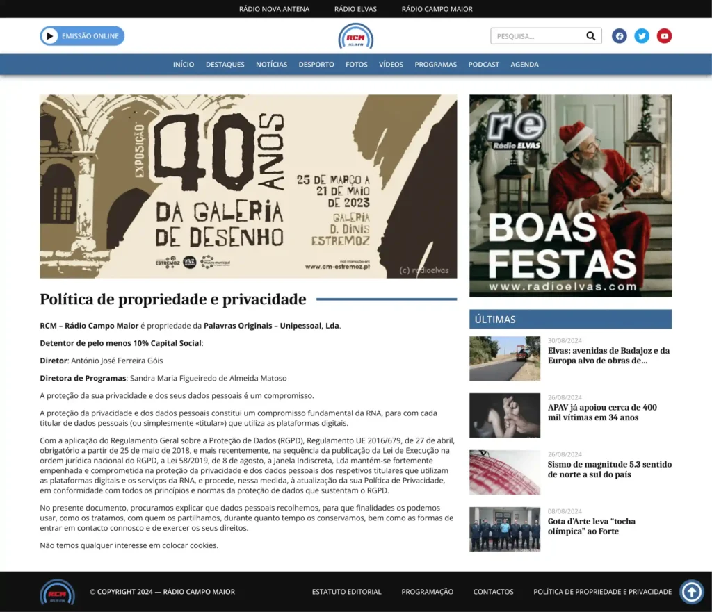
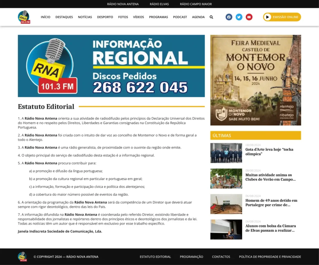
Next to a single article and category templates, we created four additional static pages per website. These web pages are Editorial Statue, Programme, Contact, Property, and Privacy Policy. All the pages are designed with simplicity in mind and are replicated with the same design on all three sites to keep visual consistency. These pages can be accessed exclusively from the footer.
Crossposting
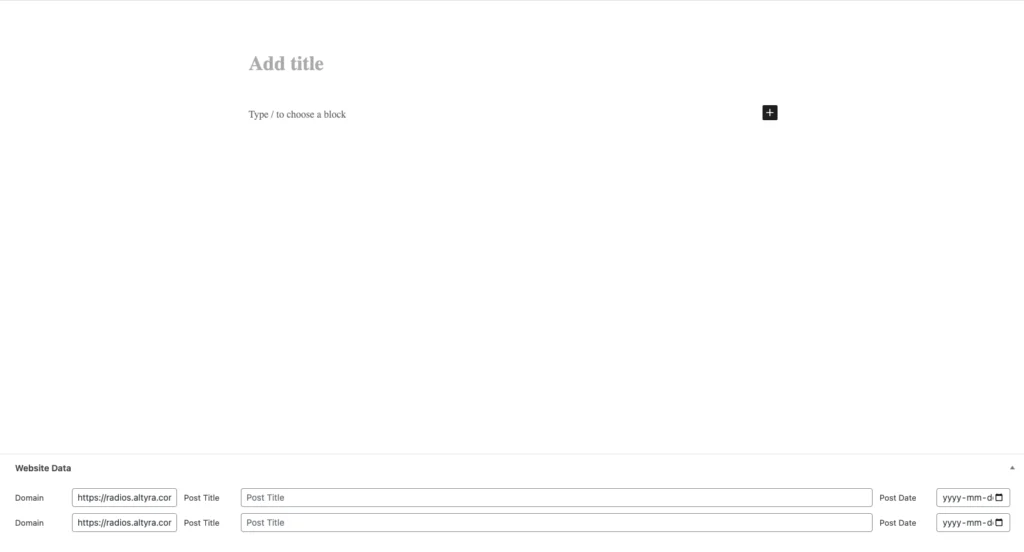
The client wanted us to develop a custom post-publishing solution for his network which would allow him to write all posts from one location and then cross-post them to other sites. With this feature, he could save time and avoid writing the same articles for multiple sites. This feature was developed by a third-party developer while we were responsible for briefing the project and later testing.
Ad Management
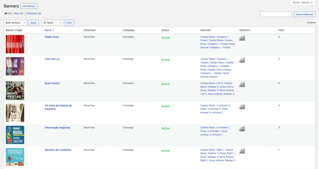
The client desired a custom ad management solution where he could administer ads for all three sites in one location. The solution was custom-developed by a third-party developer. Our function in the process was to test the plugin thoroughly, find common bugs and discuss the methodology and user flow of the plugin. We were not responsible for the development and took more of an administrative/tester role.
Gallery Slider
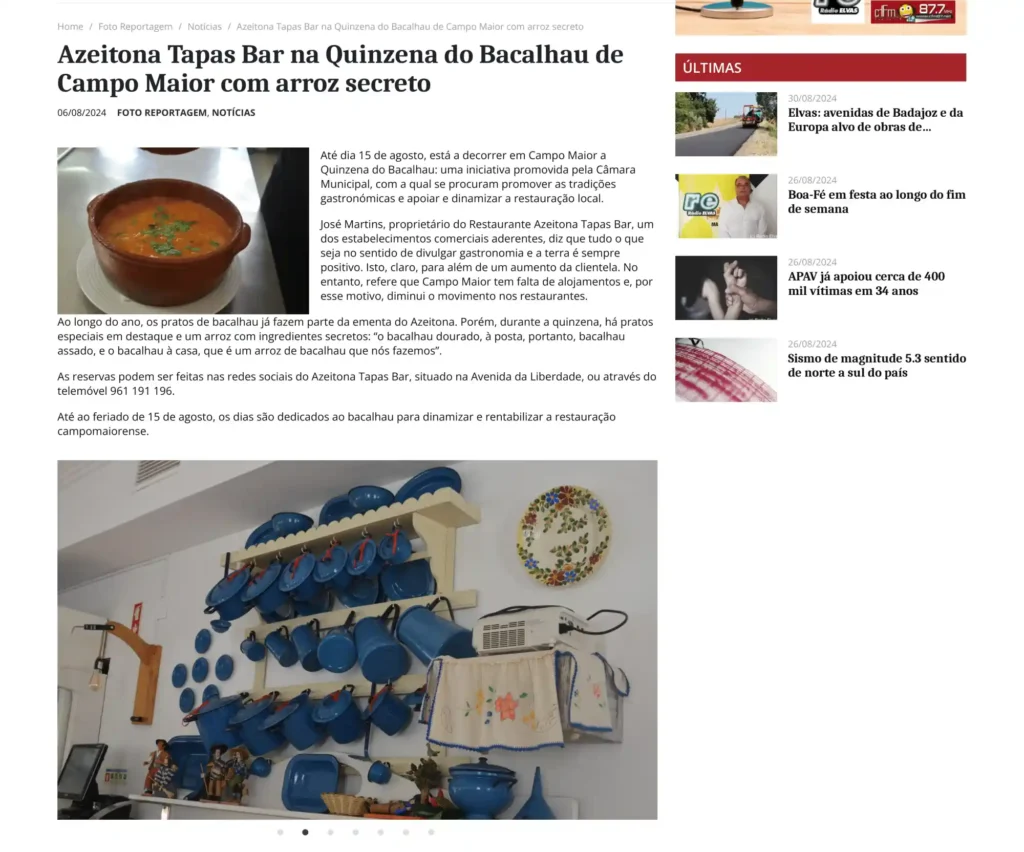
We developed two types of gallery sliders for the client. One, where the images are auto-sliding in a slideshow and the other, where they are presented in the grid and can be expanded and viewed in a lightbox.

From Classic Editor to Gutenberg
For the client, the most stressful part was changing the writing environment from Classic Editor (not updated since 2024) to Gutenberg, which is now widely accepted in WordPress. This change was crucial as Classic Editor stopped being updated recently and will eventually become abandoned with time.
Conclusion
The project has been finished with migrating the site to the client’s network and pointing the old domains to new installations. We are no longer involved in the project and the responsibility is fully in the hands of the client and his team.
