IAL: SCI Sweden
2025 | Sweden, Visby
Web Design
Client
Internationella Arbetslag (IAL) or SCI Sweden is an organisation that works for peace through international volunteer work. The organisation was founded in 1943. IAL has no profit interest and the activities are based on non-profit work. The association is religiously and politically independent.
Challenge
We were assigned to design and develop a website for IAL. Their former website lacked consistency and had issues such as broken links and non-working pages. Moreover, IAL did not have a proper visual identity in place and relied on a random colour palette and typefaces. Our goal was to refresh the website, give it a more modern, classy look, and create new informative pages and translate content from Swedish to English.
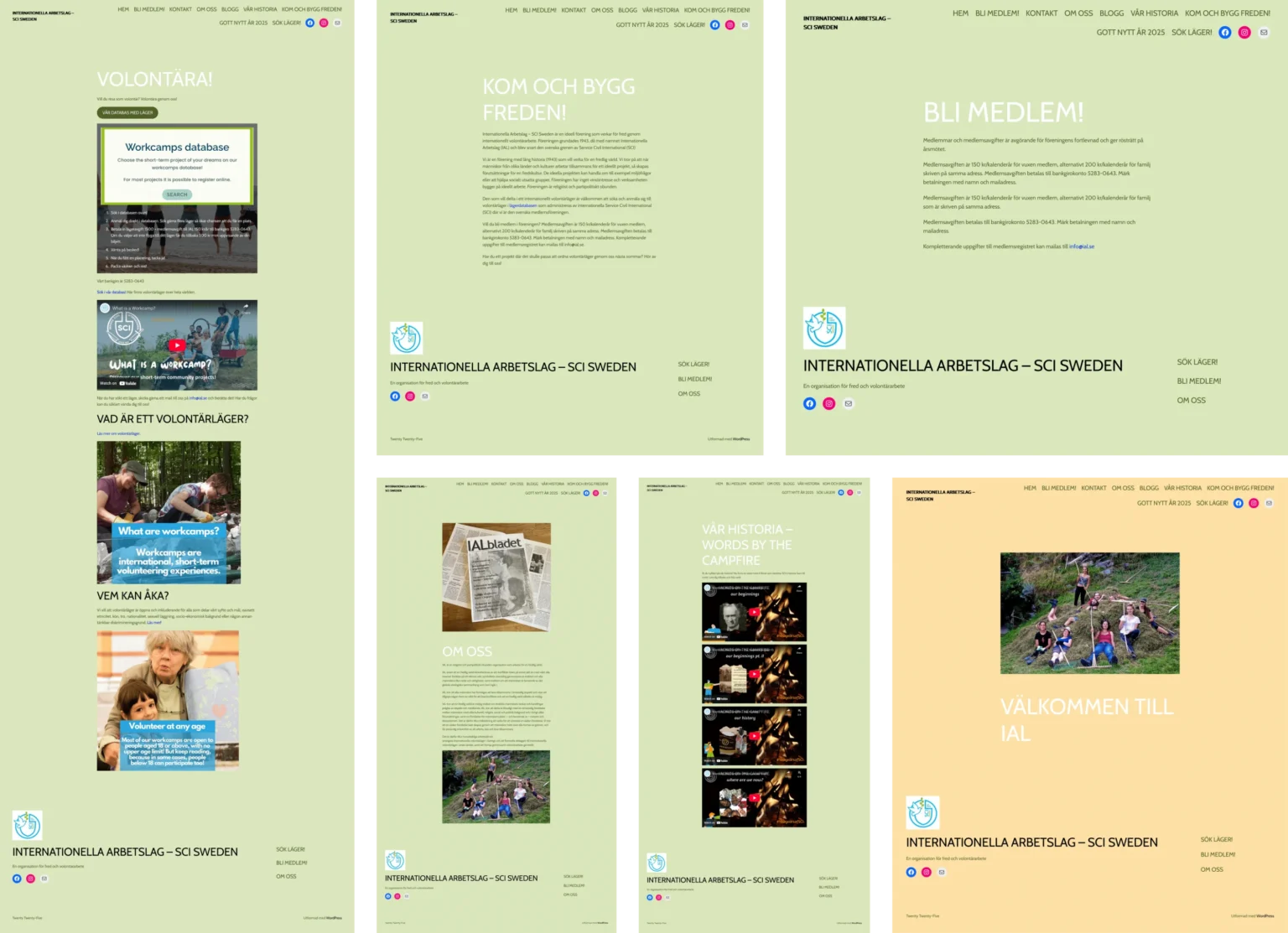
Former Website
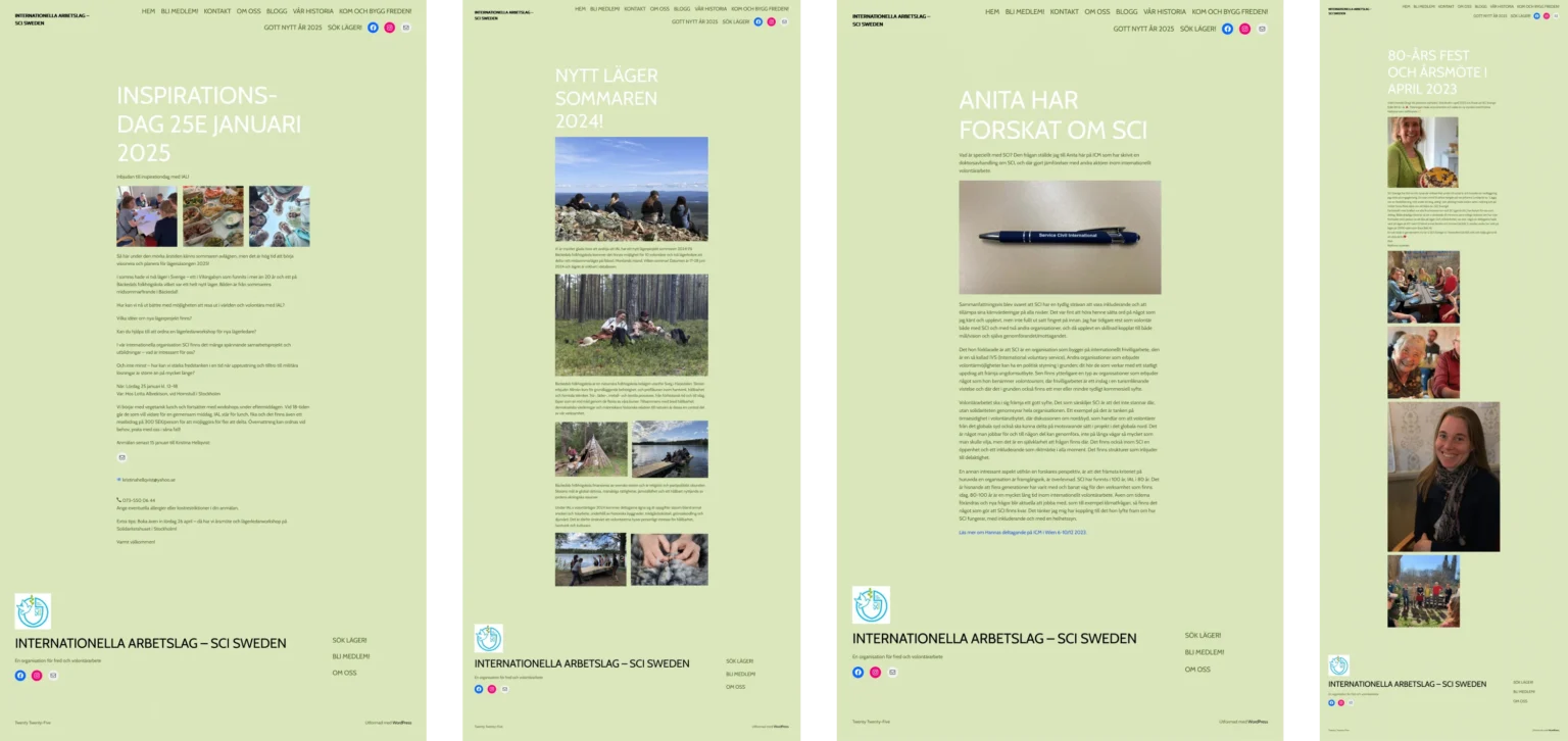
IAL had an existing website, which was developed by one of the organisation’s members. The website was non-functional and did not have a professional look. The pages had no visual hierarchy and lacked a clean and unified appearance.
For IAL, the website was the first point of contact where people could learn about the organisation and its actions. The former website did not reflect that. It was not organised and had an amateur feeling.
Design Process
We asked IAL whether they have a vision in place or leave the creative process completely to us. They decided on the second option; therefore, we had complete freedom in the design. We quickly agreed on three core priorities: visual consistency, information hierarchy, and professional look.
We knew that to develop a cohesive website, we would need to redesign it from scratch and come up with new visual solutions. Drastic changes were necessary, and some darlings needed to be killed. We embarked on a challenge that resulted in a simple, elegant and informative website.
Visual Consistency
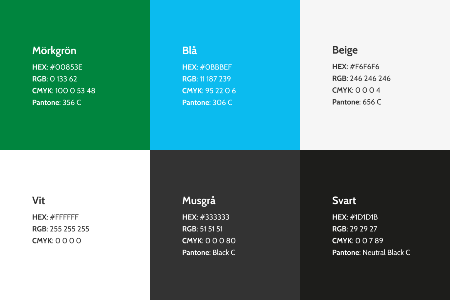
The new website had all the missing pieces. We chose one typeface (Cabin) to be used across the entire website, as well as developed a set of primary and secondary colours. Black became the primary colour for text, while white and beige were used primarily for background and dividing sections. Blue became the colour solely for links. Green was used for main headings, icons, and active links.

Information Hierarchy
In the former website, all the relevant pages were listed in the huge navigation bar—and they were not organised depending on their content. The navigation bar was growing with each page added, since there were no drop-downs for easier access. That has been changed.
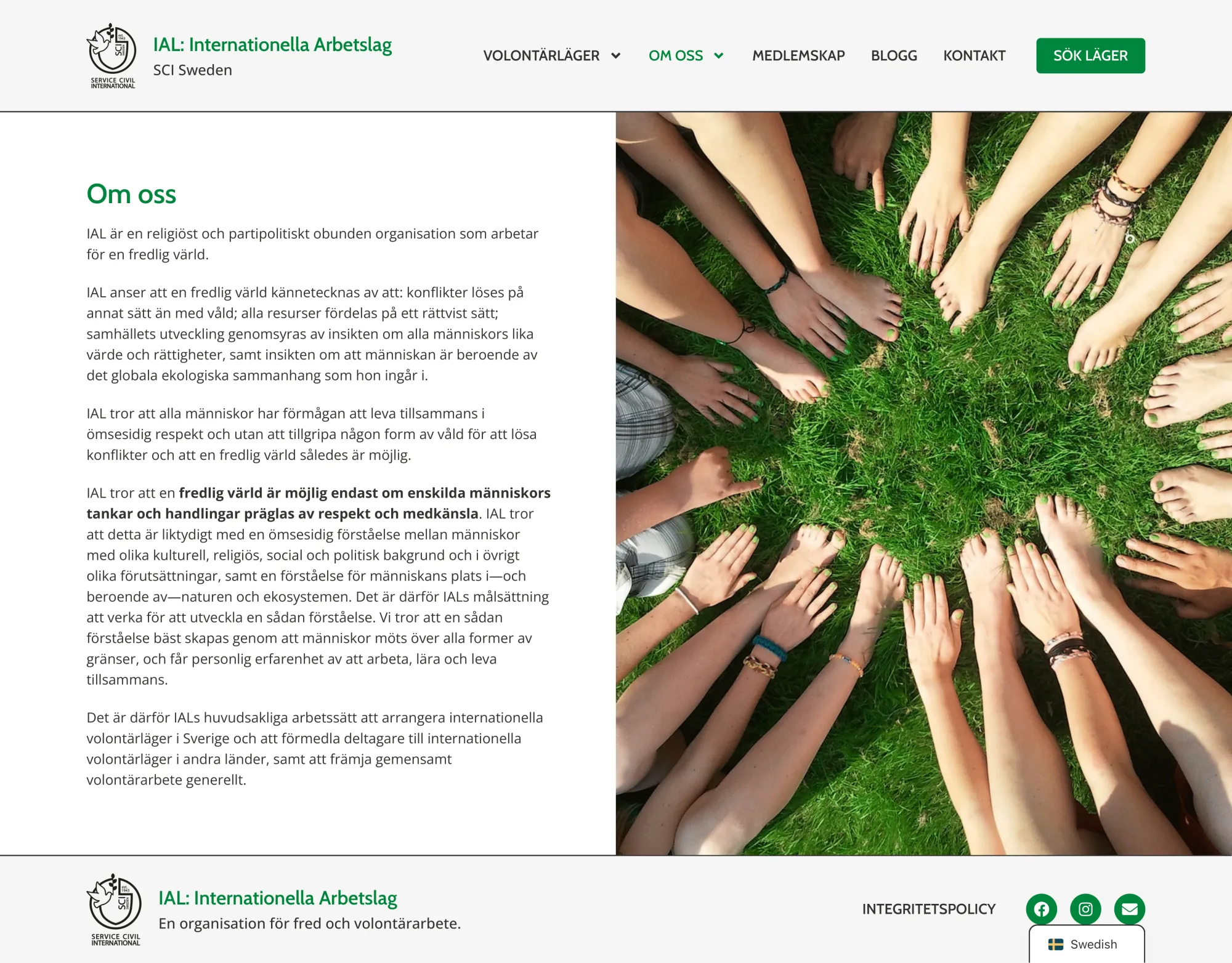
We developed a fresh navigation bar. We placed the logo and the website’s name on the left. All the pages were collected on the right, and we grouped them into parent and child pages for better accessibility. We created two parent pages: Workcamps and About Us. Under those, we placed pages with content relevant to the parent.


Professional Look
All the changes we made contributed to the creation of a professional look. Simpler and accessible navigation, unified colour palette and minimalism became the core of the website. The website no longer looked like a blog developed by an amateur.
We asked some people to give us feedback on the original website. We were told: “It doesn’t look legit”, “It looks like someone just threw content and forgot to organise it”, “It is certainly not a website for an actual NGO”. We knew these were IAL’s weak spots and our core mission was to address those issues with a fresh, clean and organised design.
New Pages
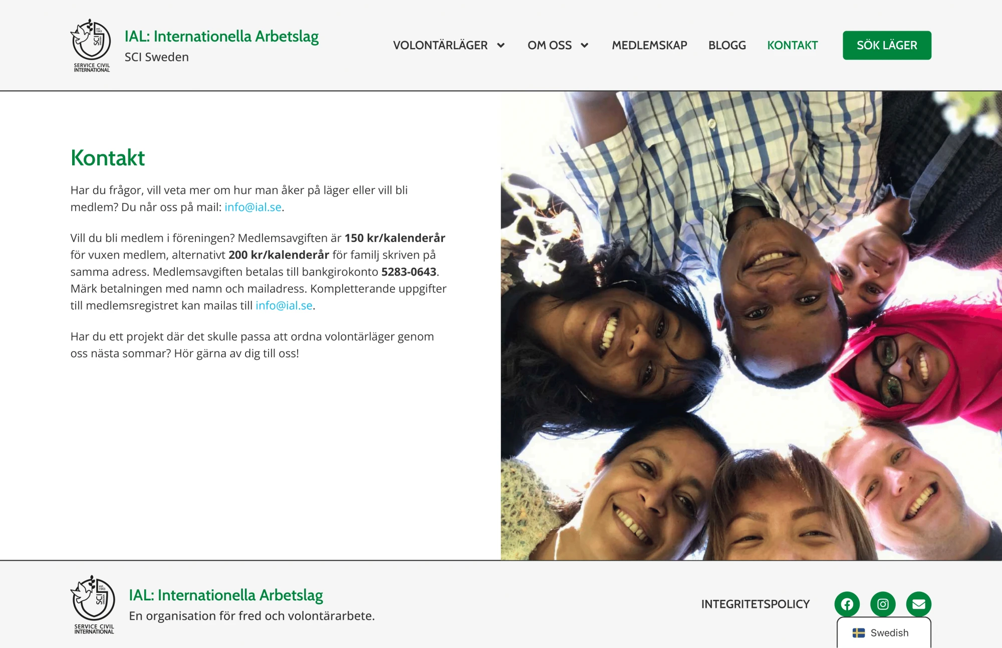
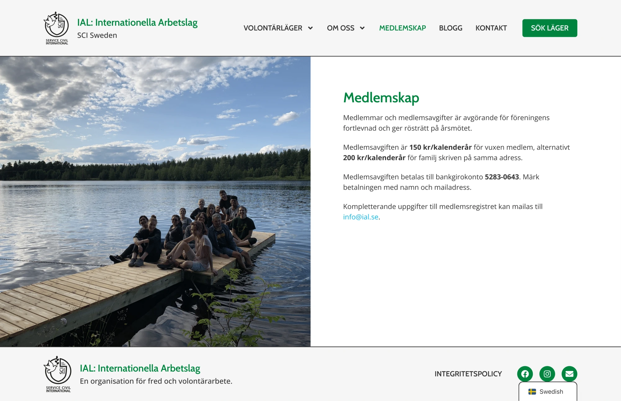
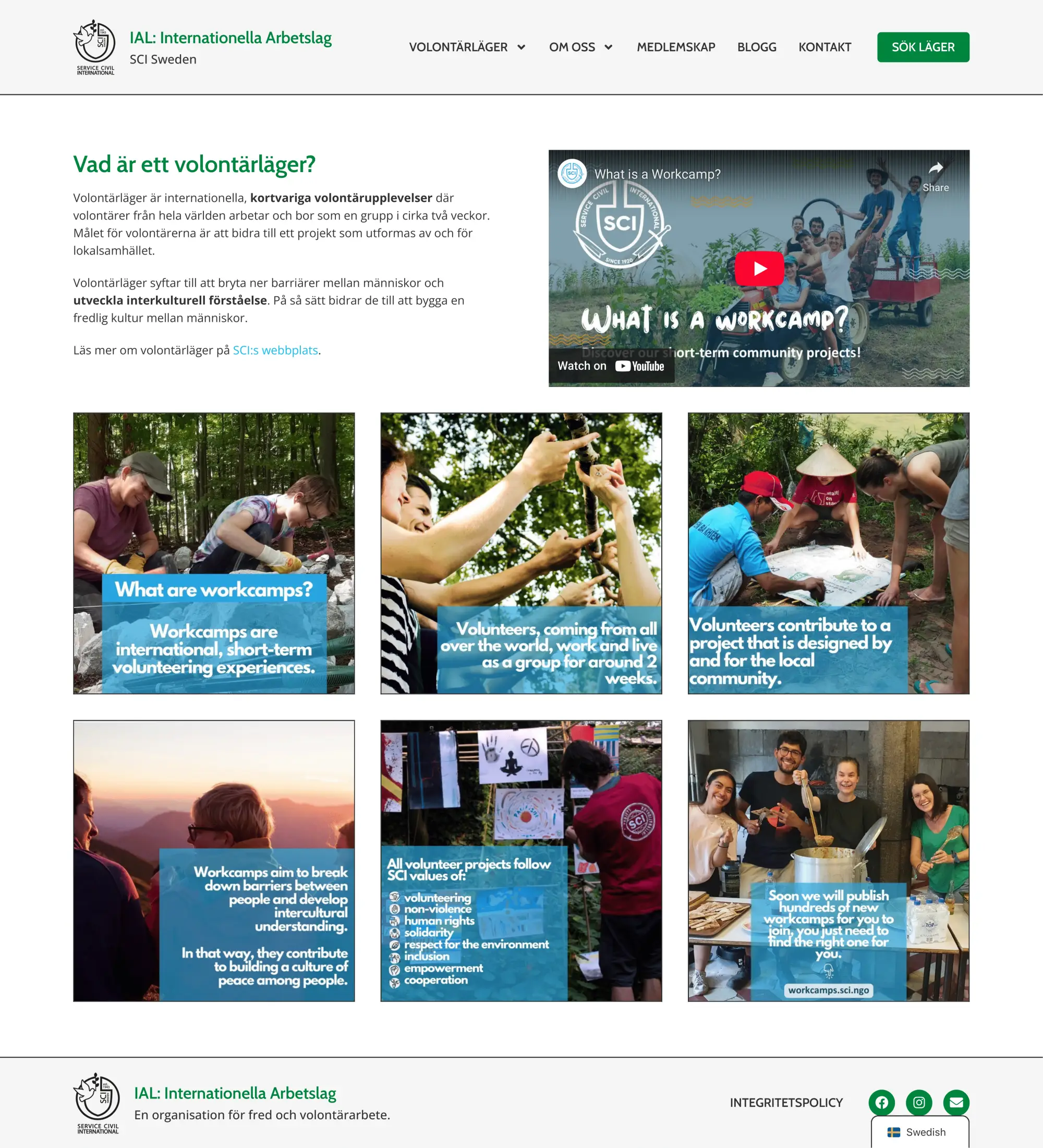
Existing pages were visually improved—images were added, and column layout was introduced. Content remained essentially the same, with some minor touch-ups here and there. Plenty of new pages were created, such as four pages with information about Workcamps, Our History, SCI’s History, and Privacy Policy.
We wanted information to be more accessible and straightforward. At the core of IAL’s actions is organising international volunteering workcamps, but the original website failed to reflect that. There was no place where all the necessary information about workcamps was collected: what they are, who can apply, how to apply, etc. With the redesign, such a place was created, and we named it simply: Workcamps.



Organised Blog
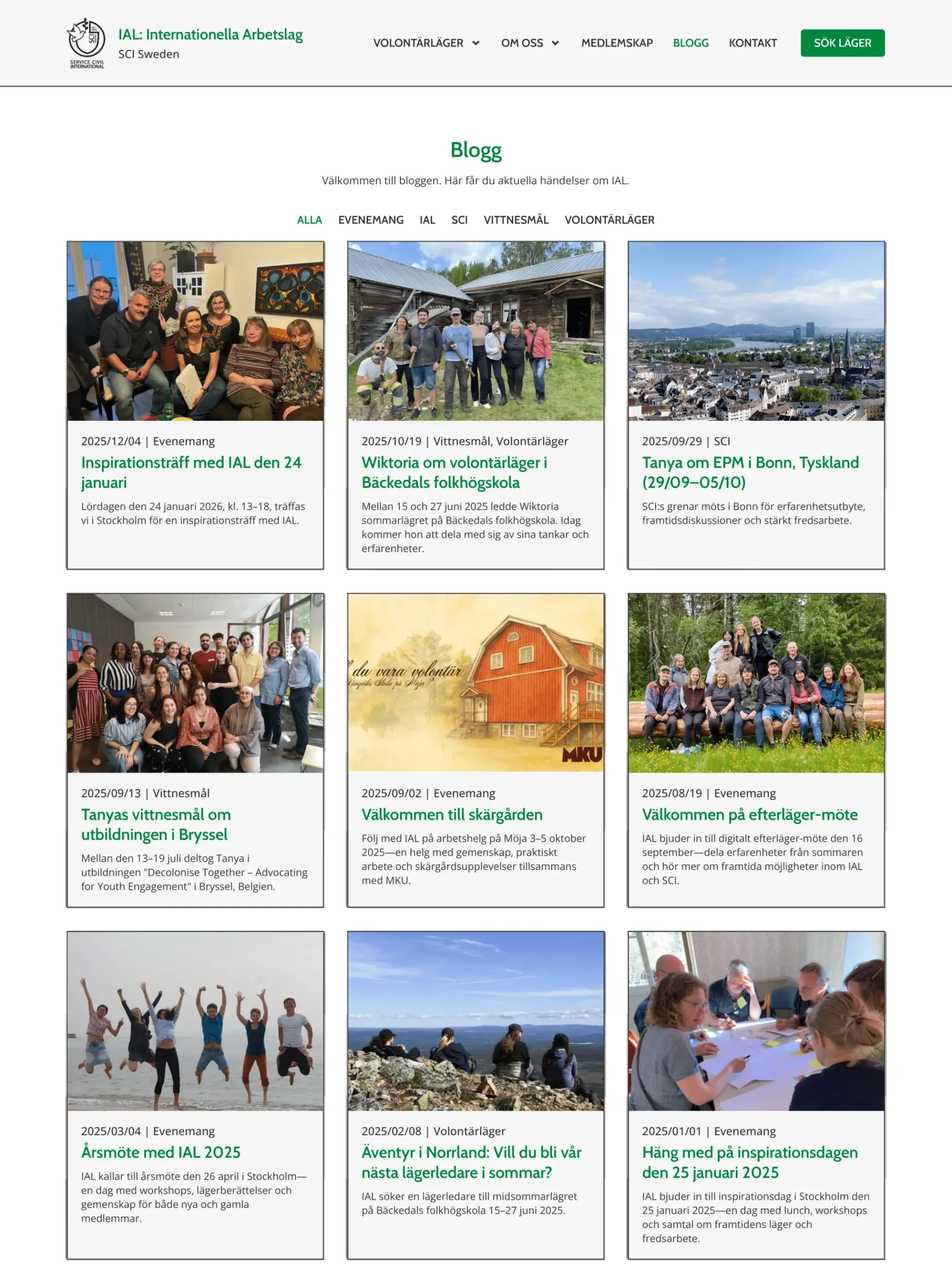
The former Blog page was messy and not intuitive. All the blog posts were collected in a single column with content overlapping, which was confusing for the reader. Instead, we created a three-column layout, and each blog post became a separate entity.
Each post now had a cover image, a short excerpt, and was assigned a relevant category. All the blog categories were collected at the top of the page so that readers could browse through relevant posts with ease.
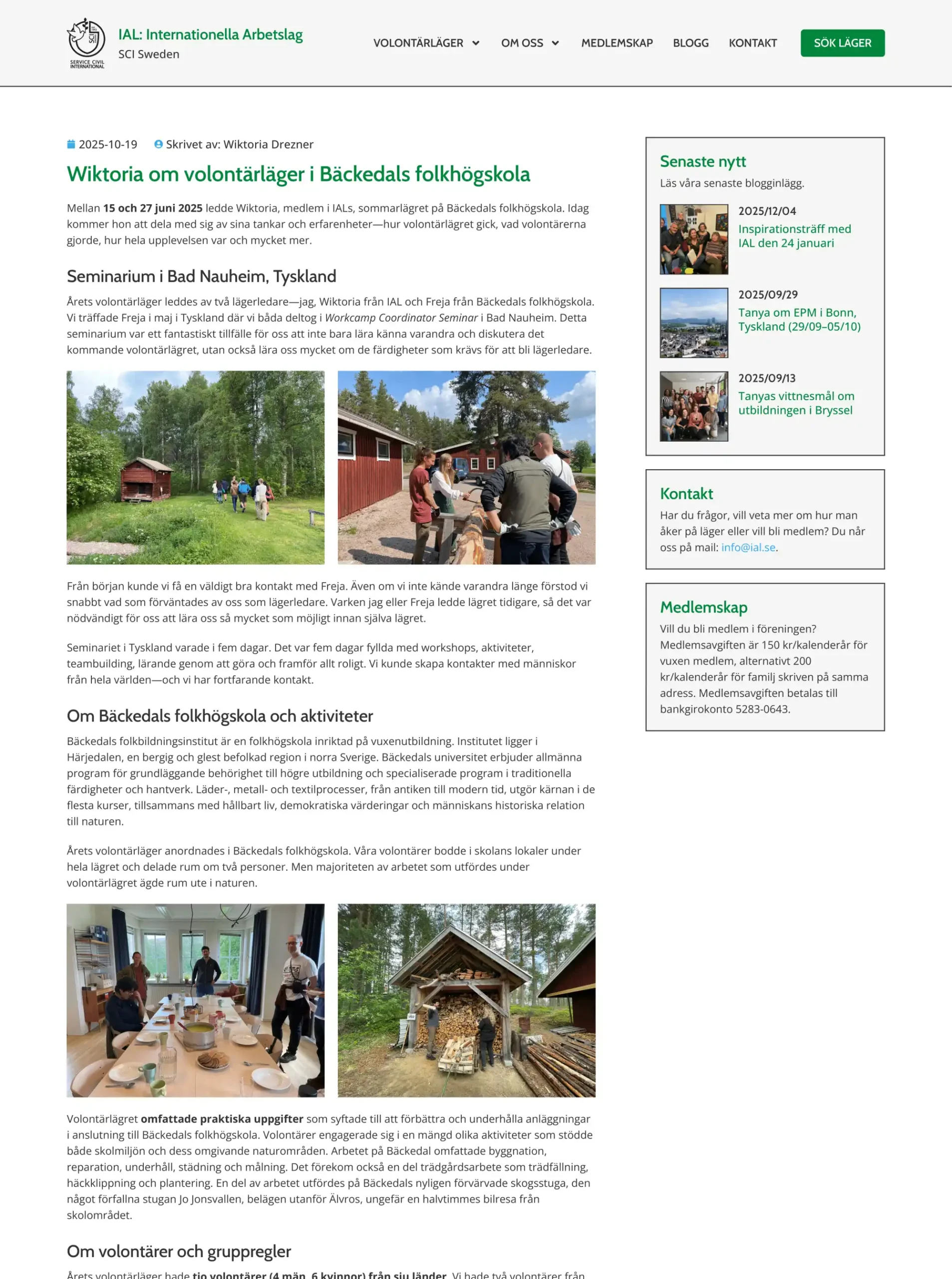
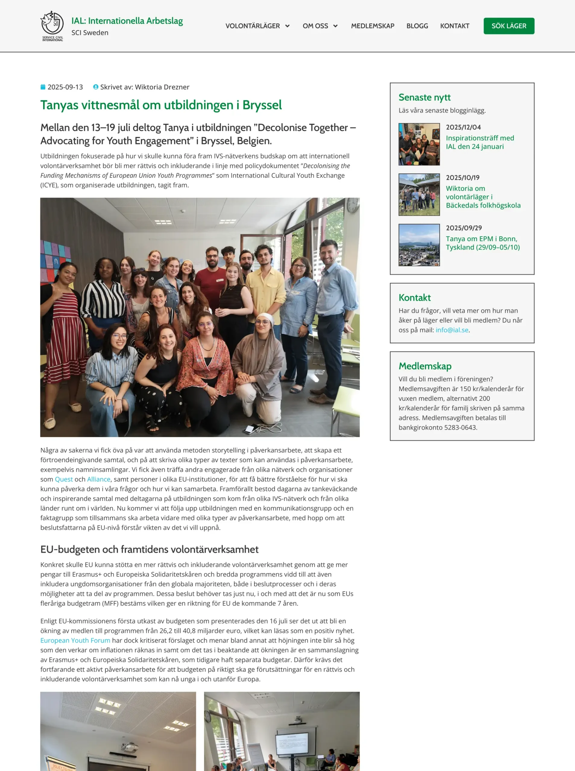
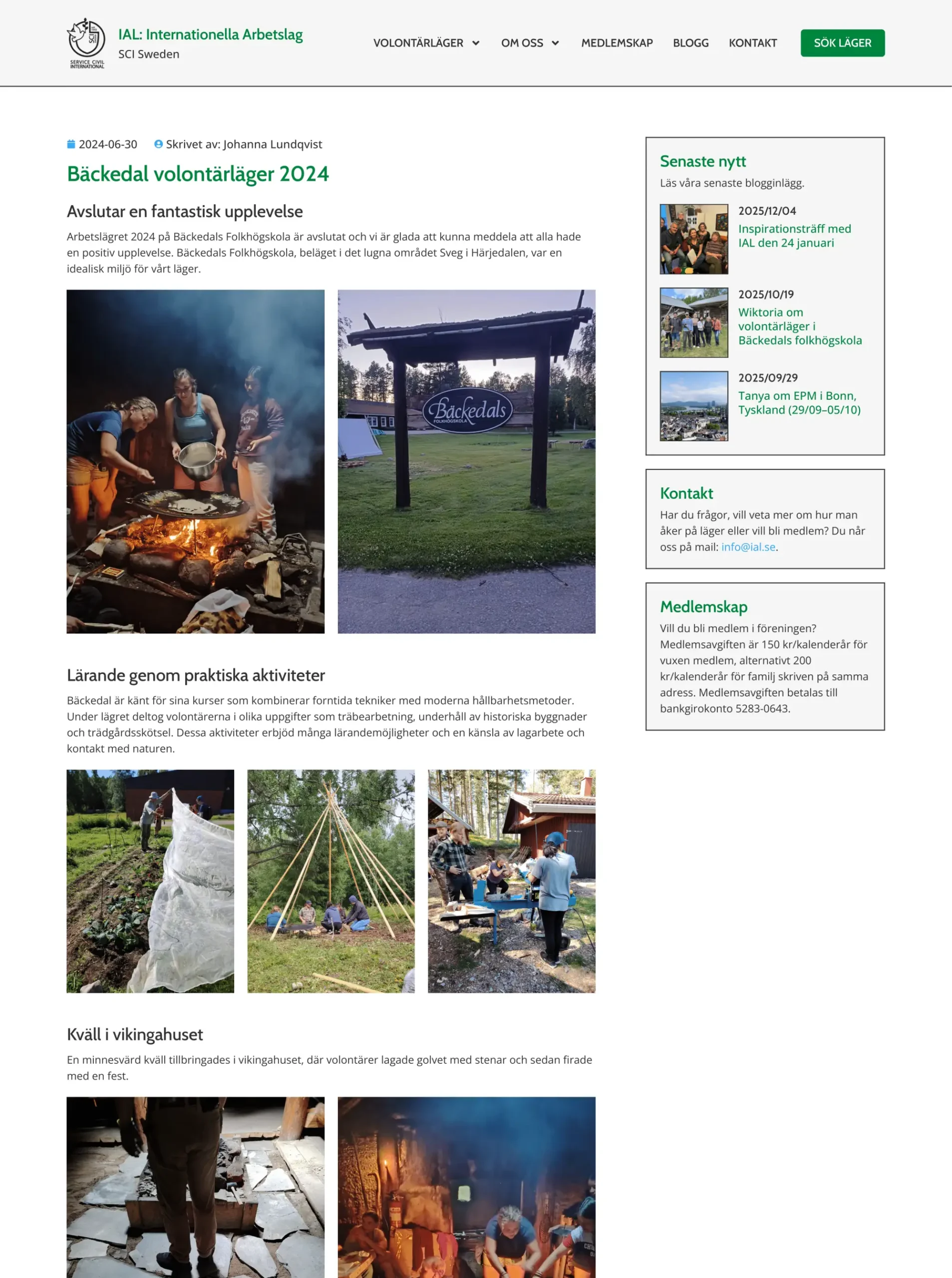
Moreover, we created a custom template for each blog post. We did that to keep the unified look across all the articles, regardless of their original formatting. We instructed the writers to keep using Gutenberg to create new posts to maintain visual consistency.
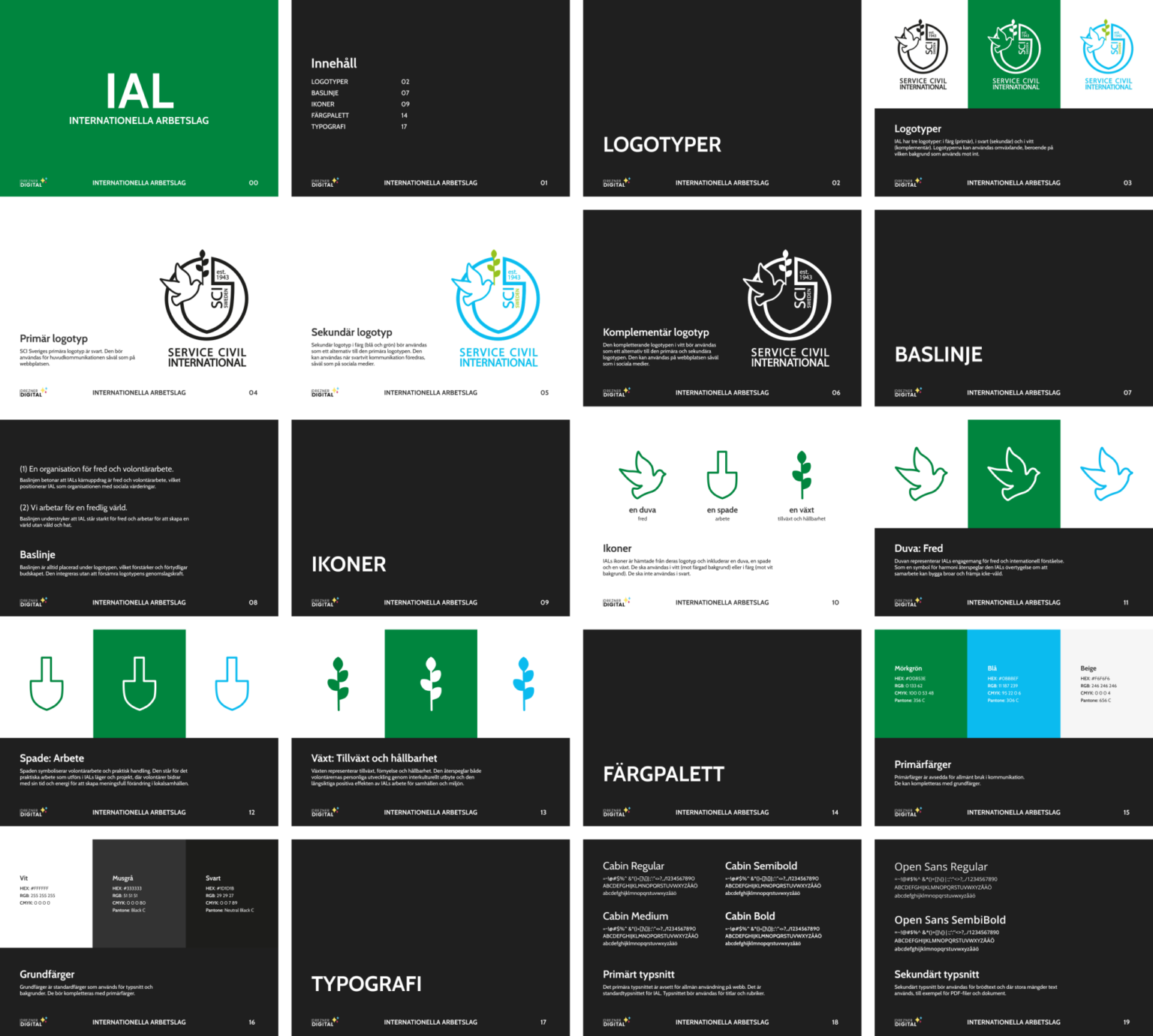
Visual Style Guide
Before, all visuals were scattered all over the place. Those working at IAL did not know how to create visually consistent documents and posts for social media. Our goal was to expand the consistency from the website itself to the whole digital presence.
To achieve that, we created a simple PDF where we collected all the necessary information about the IAL’s visual presence. The document had five chapters: Logotypes, Baseline, Icons, Colour Palette, and Typography. By reading the guide, the reader would get a complete understanding of how to create visually consistent content.
Translated Content
Since IAL is based in Sweden and primarily organises events in Sweden, the website was developed in Swedish. However, volunteers attending workcamps in Sweden are not native Swedish speakers, and it was important to make the website accessible to them as well.
To solve that issue, we translated the whole website and its content from Swedish to English. The user can now choose the language in which they want to browse the website. We made that choice to ensure that no one is left behind.
Icons
To complement IAL’s visual presence, we designed three icons to be used in communication and on the website. The icons were derived from the original SCI logo that IAL had the right to use. We came up with three icons: Dove (peace), Spade (work), and Plant (growth and sustainability).
The icons reflected the IAL’s core values. Dove is the symbol of peace since IAL is committed to peace and international understanding. Spade symbolises work, which is reflected in workcamps that are being organised by the organisation.
Last but not least, the plant reinforces growth and sustainability, since IAL believes that volunteers through work grow personally and contribute to a more sustainable society.
Conclusion
The website is now complete and fully developed. We continue to work with IAL and are responsible for managing their website. We keep adding new content and creating blog posts. Moreover, we assist IAL with their digital presence overall—when creating social media content and official documents.
