Concept Creation • Visual Identity
Ginbär
2021 | Sweden, Jönköping
Concept
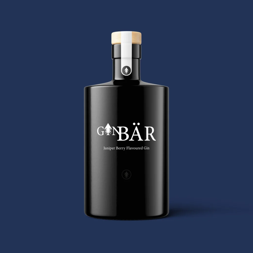
Ginbär is a small company founded in 2015 by two childhood friends. In the very north of Sweden, rich in forests and unspoiled nature, they produce and sell locally manufactured gin. Ginbär is a modern and clean brand, priding itself on its delicious taste and the highest quality product.
Challenge
The project objective was to create a visual identity for a Swedish gin manufacturer, focusing on visuals and thoughtful choices. We delivered brand guidelines and strategy, designed the logo and selected the colour palette and typeface.
Project collaborator: Laila Sobottka.
Origin
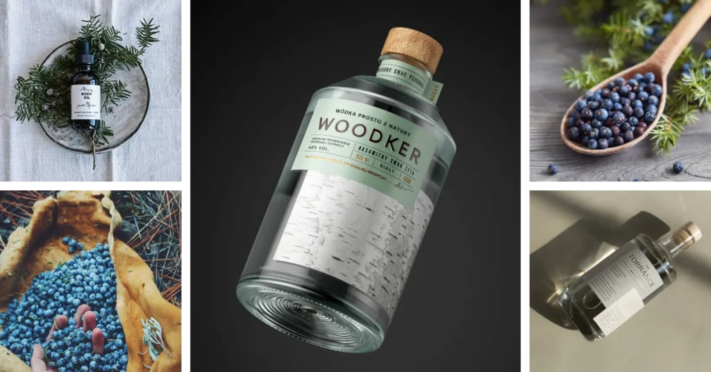
Ginbär is a combination of gin and bär (berry). Juniper berries have a strong, bitter, slightly peppery flavour and gritty texture. They are carefully selected so that the Ginbär brand gin is distinguished by its aroma and delicacy.
Ginbär believes that the best things come from nature and collects the berries straight from the Swedish forests, paying tribute to what’s local.


Primary Logotype
The primary logotype of Ginbär is kept in black and white convention to highlight the elegance and minimalism of the brand.
Background: The logotype should be used with black text and a white background when possible. When using the logo with another background brand colour, one should choose the white-coloured version of the logotype to maintain readability and clean appearance.
Clearspace: Ginbär wants to be perceived as a clean brand. The space around the logotype should be minded to keep the minimalist look: in width—min. 0,15 of the width of the logotype; in height—min. 0,37 of the height of the logotype.
Minimum size: 40 mm wide for print, 49 pixels wide for digital use.

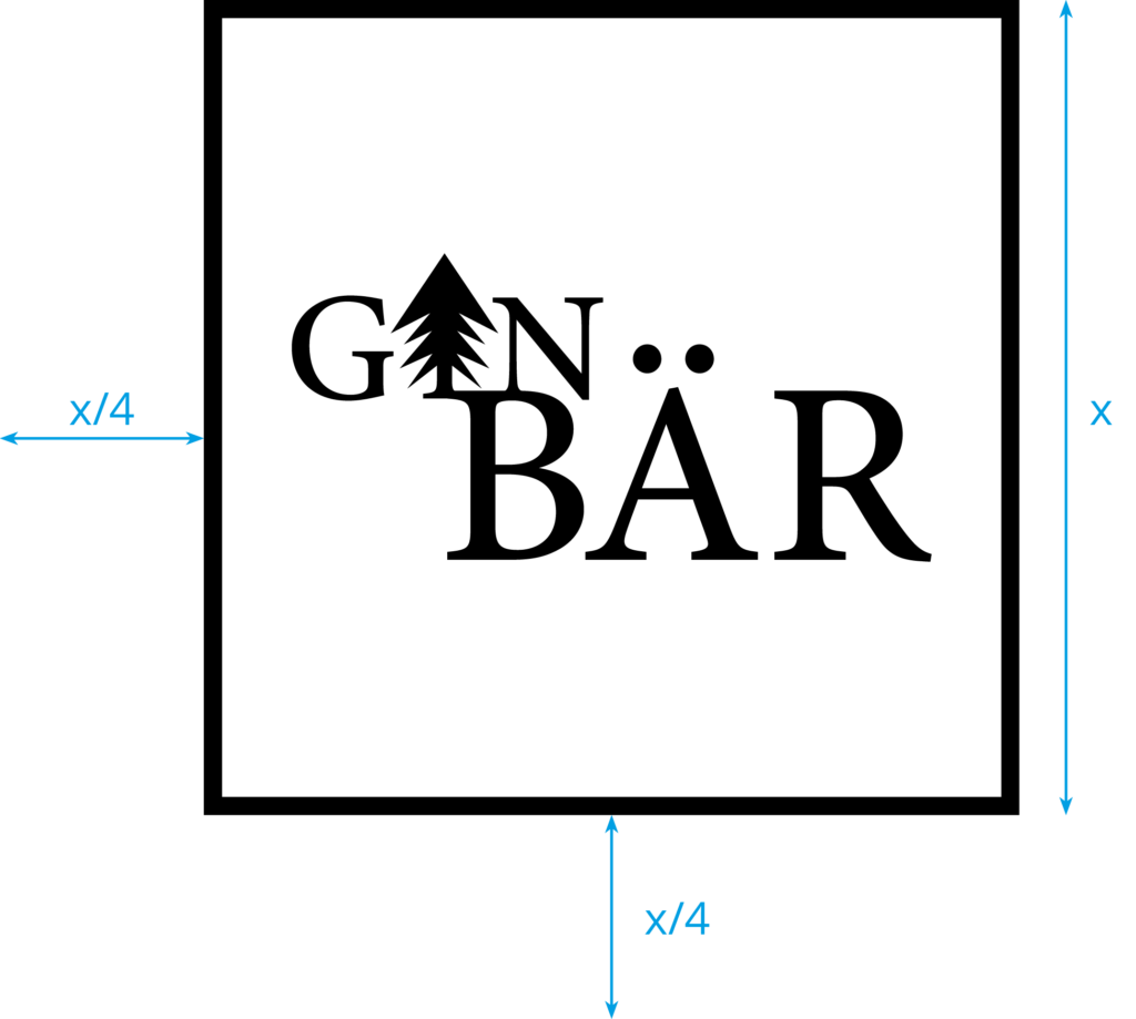
Secondary Logotype
The secondary logotype of Ginbär is designed with the intention of usage for digital media. It may also appear when the width is limited, and it is required to use a narrow version of the logotype.
Background: The secondary logotype should not be changed. The background colour is white, and the typeface remains black. Using other versions of this logotype in both print and digital media should be avoided.
Clearspace: Ginbär wants to be perceived as a clean brand. To keep the minimalist logotype look, the space in width and height should be minded—min. 1/4 of the width/height of the logotype.
Minimum size: 30 mm wide for print, 55 pixels wide for digital use.


Visual Elements
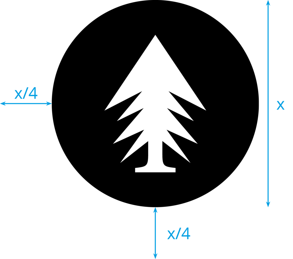
Ginbär strives to be perceived as a modern and clean brand and desires to be connected with nature. We designed two visual elements that one can use in print, digital media and physical products. No other background colours should be used with the elements other than black and white.
Minimum size: 17 mm wide for print, 21 pixels wide for digital use.
Colours
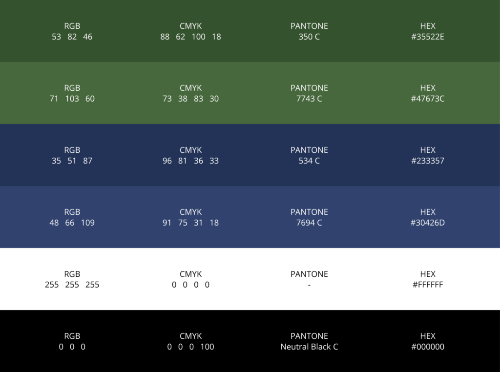
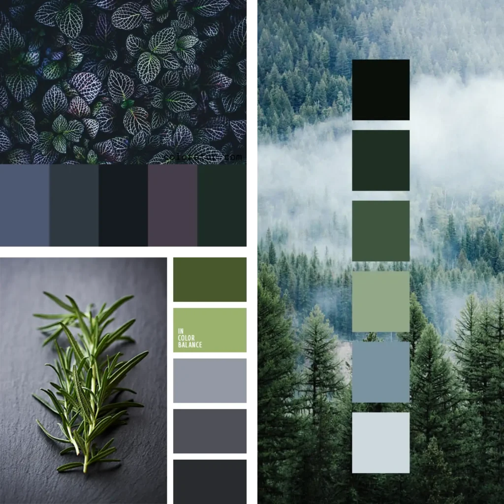
We selected a palette of six colours, including two shades of blue and green, black and white. We wanted the colours to match the energy and notion of the brand, with green colour reflecting the forest nature of Ginbär and blue colour—juniper berries.
Typography
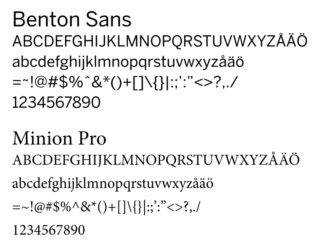
We chose two typefaces, Benton Sans Regular and Minion Pro. Benton Sans should be used for body text and digital media, while Minion Pro can be used in printed body text, and it is a part of the Ginbär logotype.

Social Media
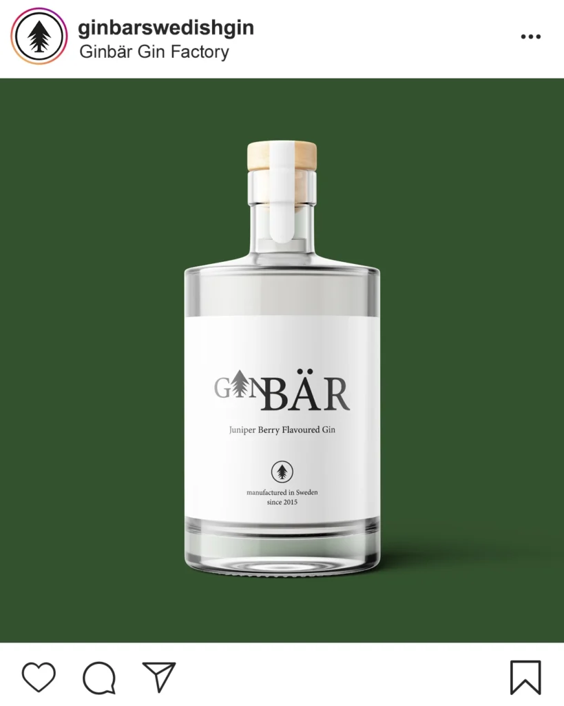
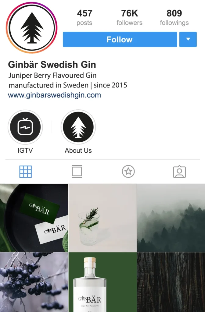
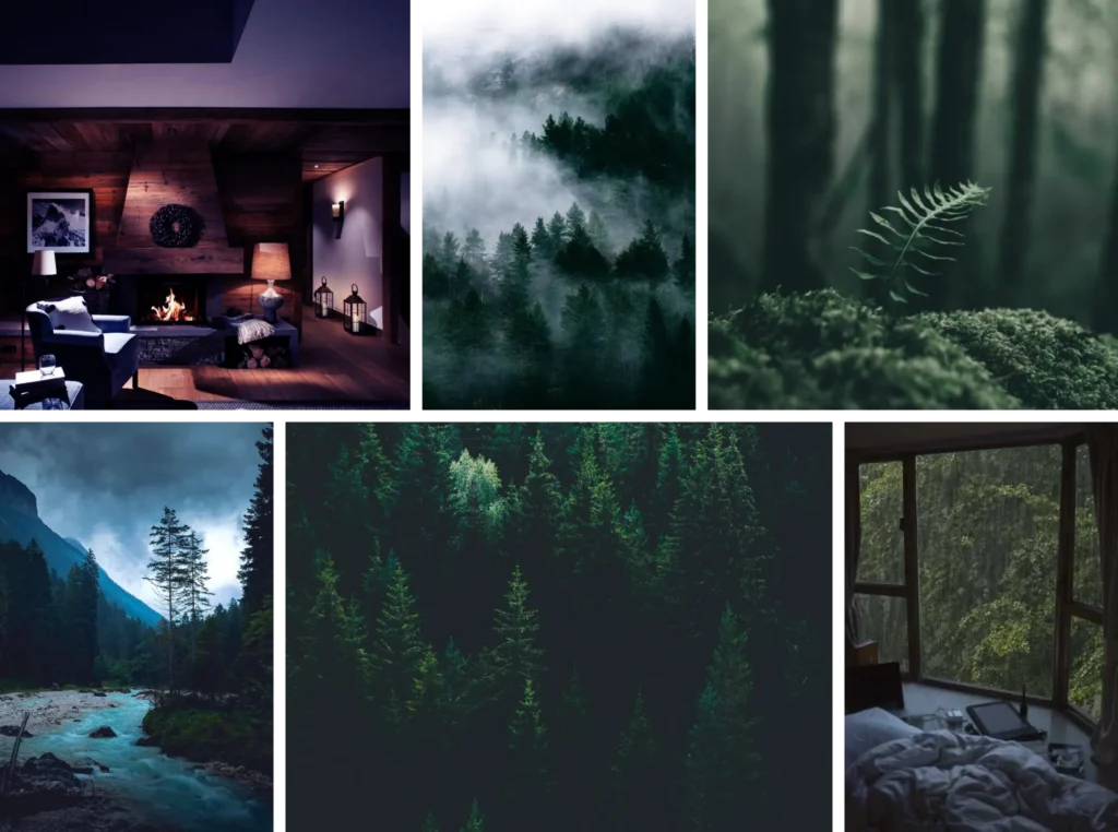
Ginbär is active on social media, particularly Instagram, where they post inspiring images connecting people with nature. They want to present them with the notion of enjoying a glass of Swedish gin, locally manufactured with love.
We created a bunch of product mockups and a sample Instagram post and feed to have a good understanding of Ginbär’s online presence.
