IKEA: Welcome Home
2023 | Belgium, Brussels
Web Design
Client
Welcome Home is a program created by IKEA in Belgium and Luxembourg in 2021. It helps vulnerable single-parent families to facilitate their access to decent housing. For IKEA, decent housing means an accessible, healthy, well-appointed and affordable living space where you feel safe and where you can rest, live and be yourself.
Challenge
IKEA’s goal is to support single-parent families. Most importantly, IKEA strives to raise awareness among the general public of the issue—and for this purpose, the website was needed. Although the website for the project existed, it lacked visual consistency and thoughtful design. Our goal was to give the website a makeover, create a new layout and improve consistency.
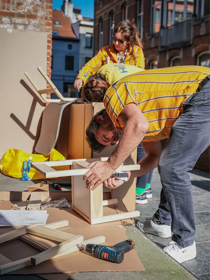
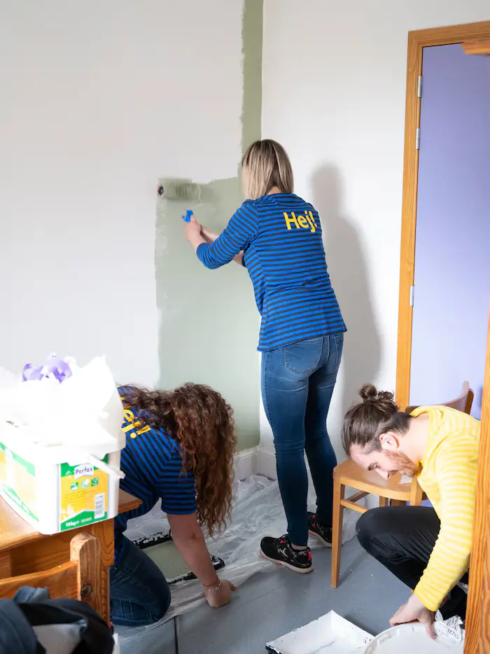
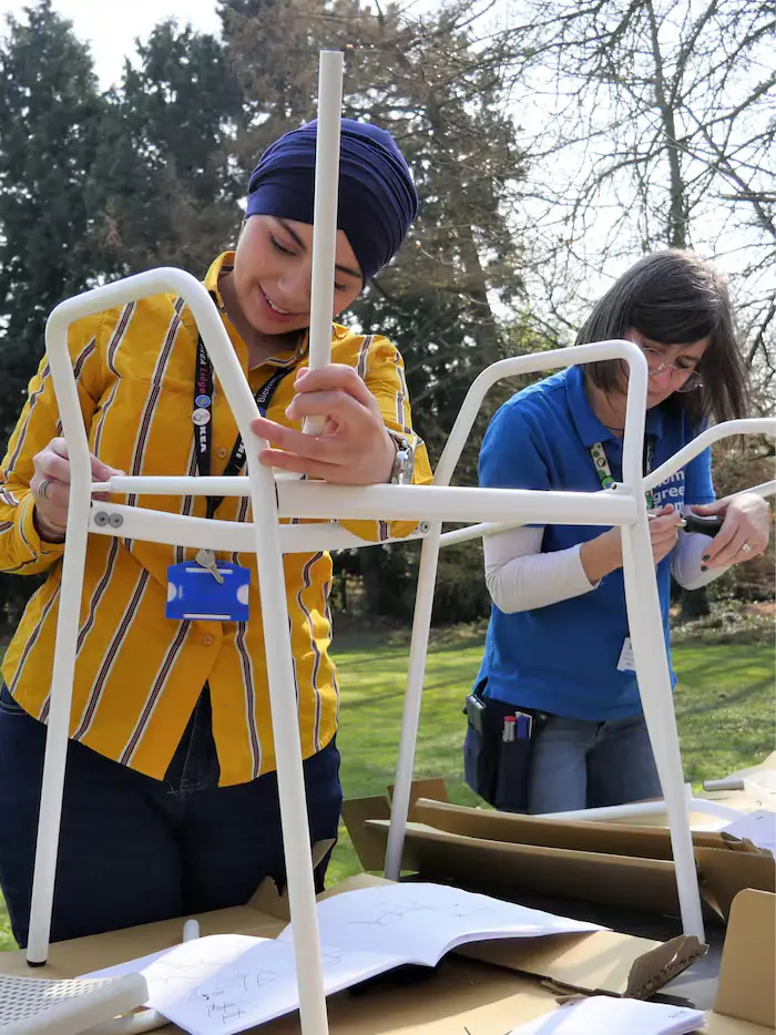
Former Website
The core issues regarded consistency, lack of order and visual hierarchy. The website used colours and fonts that weren’t part of IKEA’s branding. Issues were present, such as different fonts in one paragraph, cropped images, non-working links and sections with little substance. The website was not responsive and accessible.
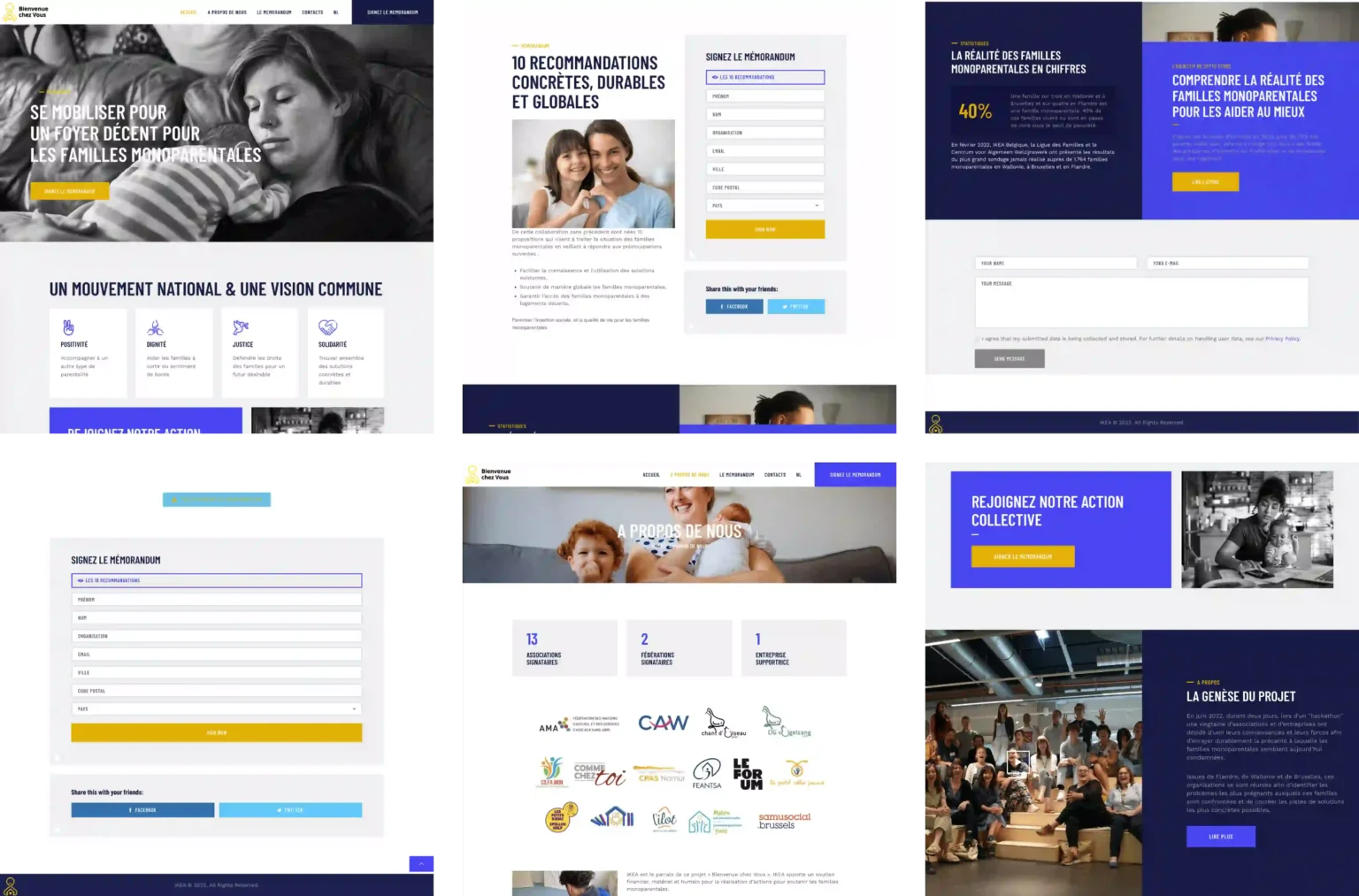
Website Redesign
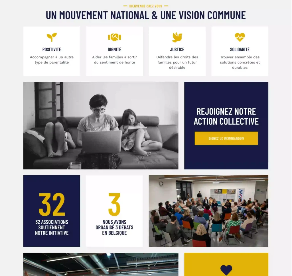
The website has received a full-on makeover. We simplified the colour palette to include colours only from the IKEA branding. To ease the editing for authors and editors, we developed a boxed layout with Flexbox containers. We ensured that all links worked correctly and improved the viewing experience on smaller devices.

Memorandum
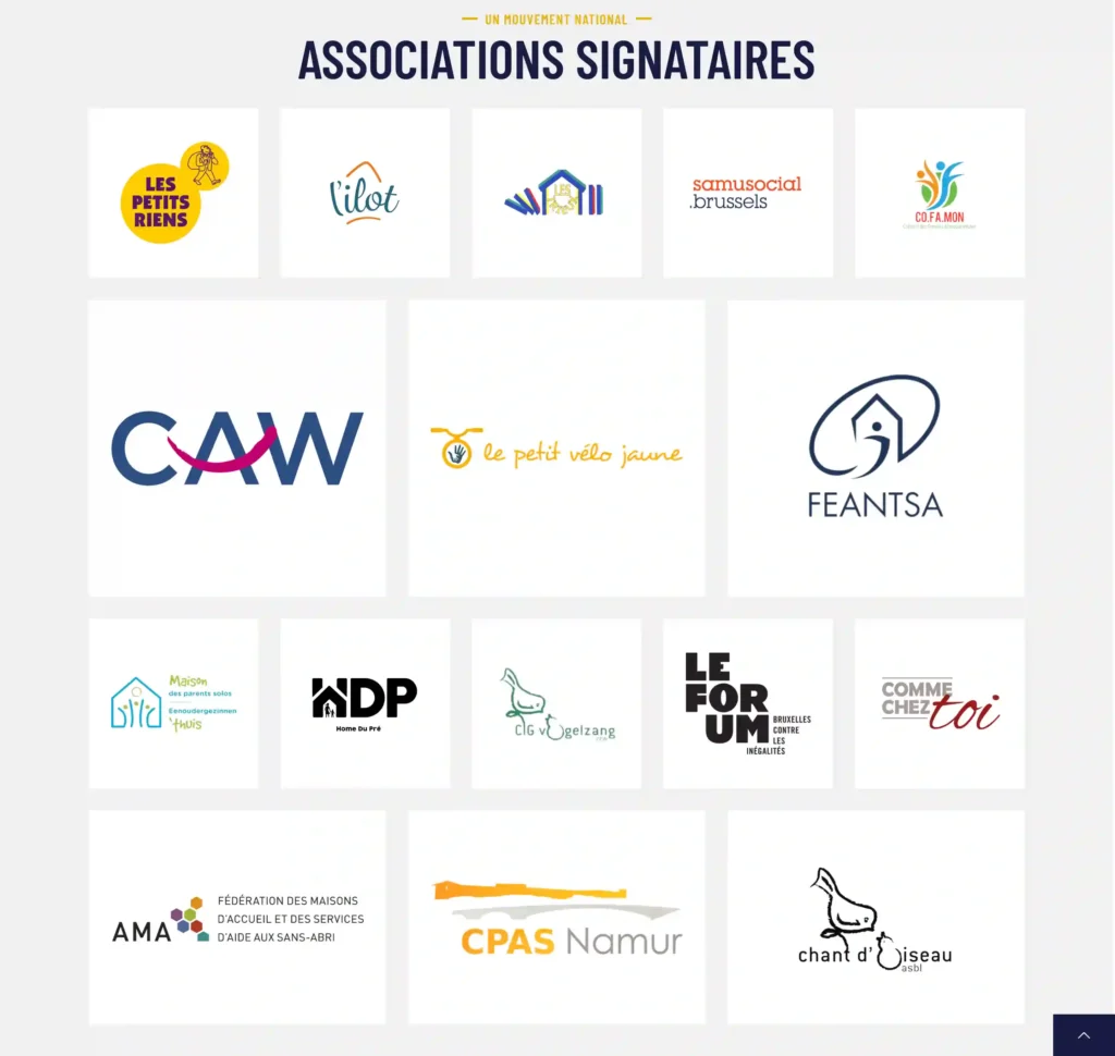
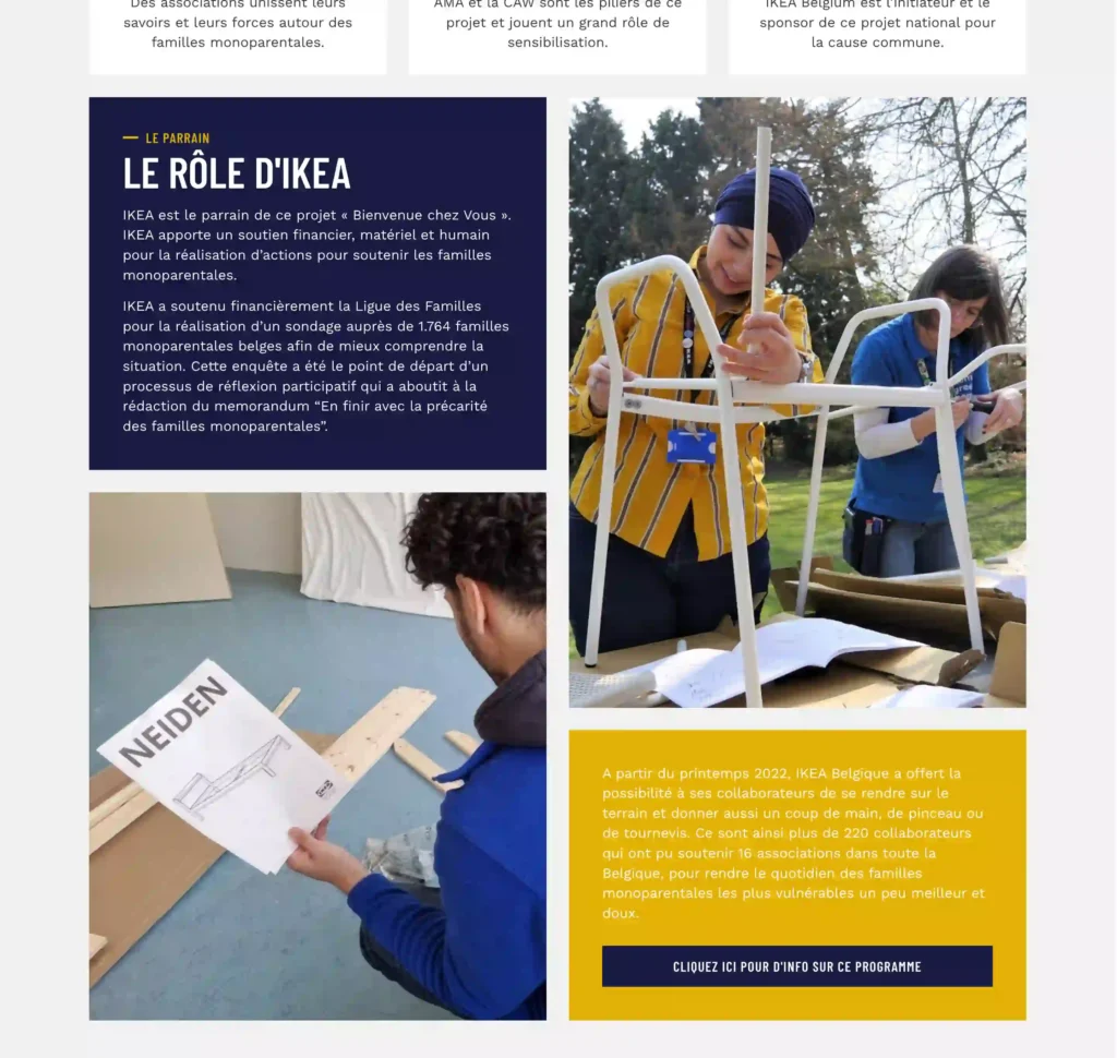
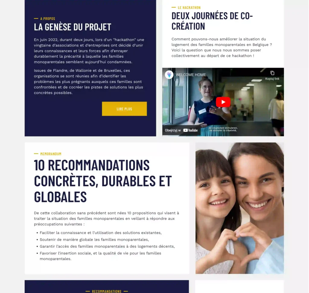
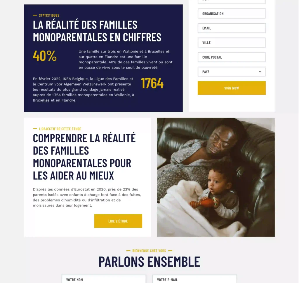
A memorandum is a document of 10 proposals that aim to address the situation of single-parent families in Belgium. The document is the highlight of the website. Therefore, the page featuring the memorandum had to be the most memorable. Due to a large amount of factual data and statistics, the information had to be presented in a concise and accessible way.
News
On the original site, there was no page devoted to recent news regarding the initiative. Creating one became a project priority. The news page had to be optimised and highlight the most recent and crucial events at the top. On top of that, we created a template to use for every post to keep the visual consistency and ensure compatibility.
Conclusion
The website is now in the hands of the team responsible for the IKEA project. The team has been introduced to the builder and showed how to implement new content. Further edits and layout changes are not of our authorship.
