Lynkrr
2023 | Sweden, Göteborg
UX/UI Design
Client
Lynkrr is a Swedish SaaS platform that offers all the support for foreign females to start a self-employment journey. They provide all the tools necessary so they can enter the Swedish market, sell their skills and earn a living.
Challenge
Our main task was to redesign the company’s web application to give it a different, more professional tone. We worked closely with the technology responsibles to deliver the best visual and user experience. We focused on consistency, rebranding, minimalism and clarity in the project.
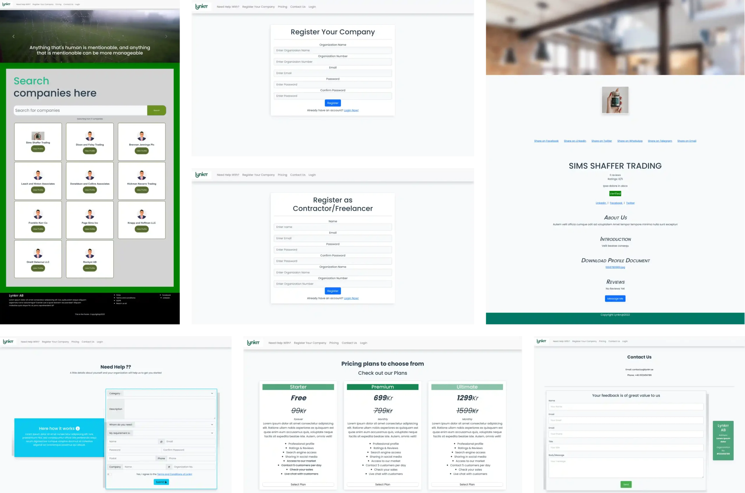
Before
In the first stage of our journey with Lynkrr, we focused on developing the front end of the web application. Before, the application lacked consistency and a cohesive feel, which immediately became our primary concern. We decided to focus the energy on rebranding the application so that it speaks for what it stands for. It is clean and UX-friendly, with a modern touch.
After
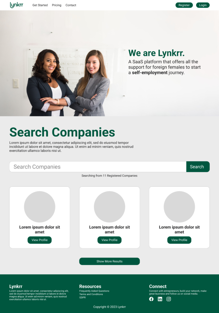
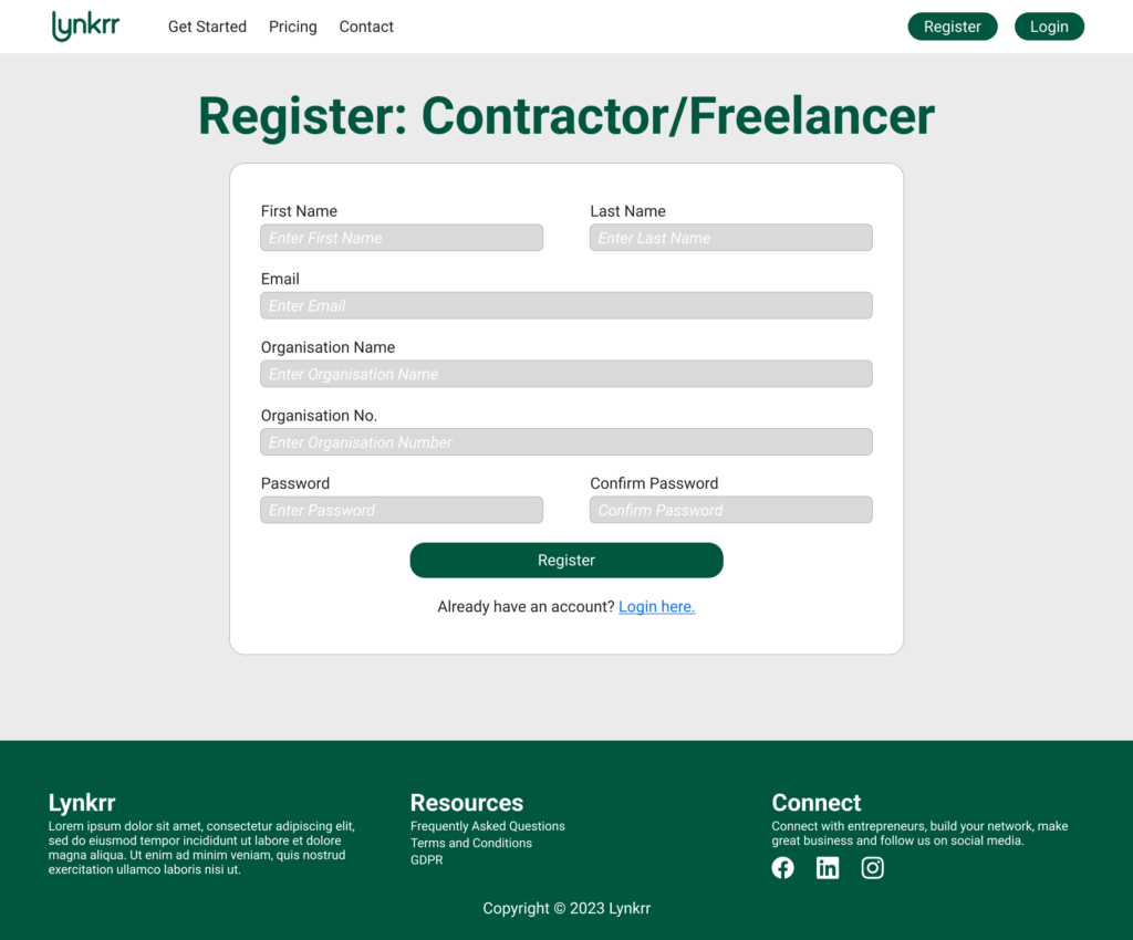
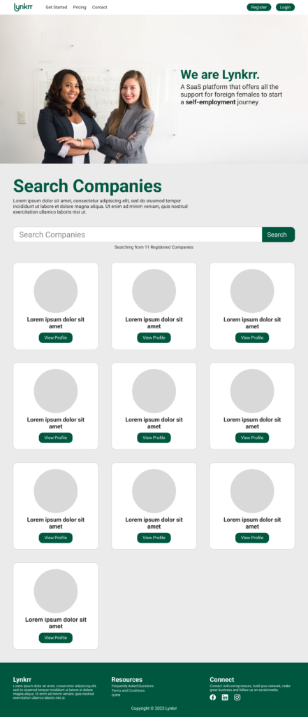
The application now has a professional tone. It has a clear branding strategy implemented and follows a unified design across all the pages.
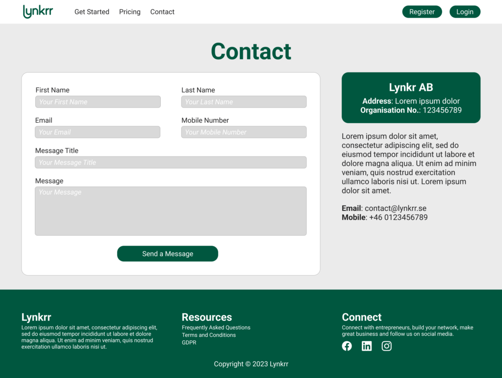
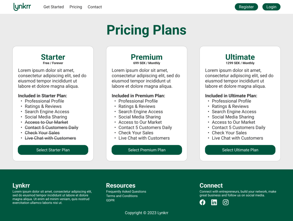
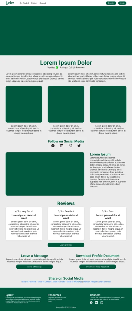
The website follows a new column layout. The use of colours is limited to white, grey, green and black. The profile pages allow for personalisation with different shades, unique banners and images. All the pages follow unified hierarchy principles and visually match together.




Navigation
Navigation bar is white with a transparent logotype. The relevant links are kept to the left, while action buttons for login and registering are moved to the right.
Footer
The footer is now kept in green colour on all pages. It is divided into three columns, where the first describes the company, the second keeps all the relevant links together, and the last is devoted to social media.
Visual Style Guide
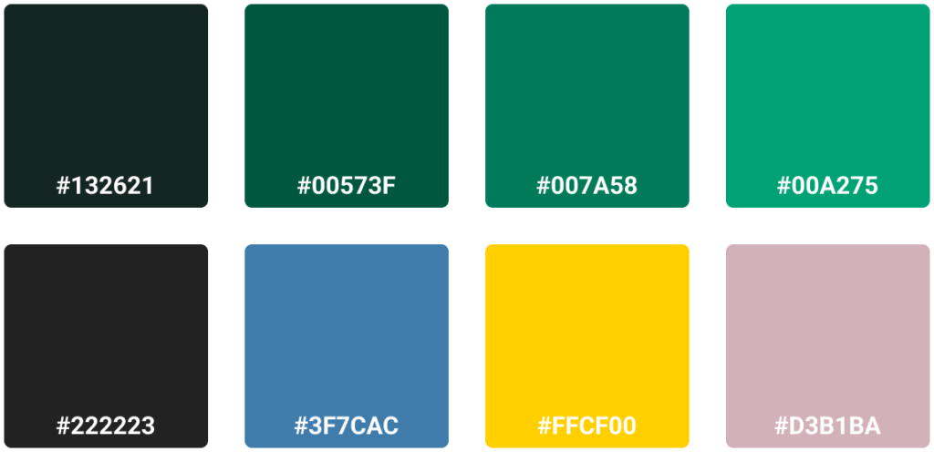
One crucial part of developing a successful brand is ensuring consistency across all the brand touchpoints. Lynkrr didn’t have a concise visual style guide to work with, and our goal was to create a document that would hold all the necessary visual elements and information about the tone and the brand.




Guidelines
The guide is meant to be used by all the employees who will need to create content and further shape the brand. It contains valuable elements and data on how the brand wishes to visually present itself in the professional context.
This guide will be redefined and updated once the communication needs to be revised or the brand needs to change. It is a dynamic document where content can be altered and refined according to updates, changes and new ideas.



Profile Templates
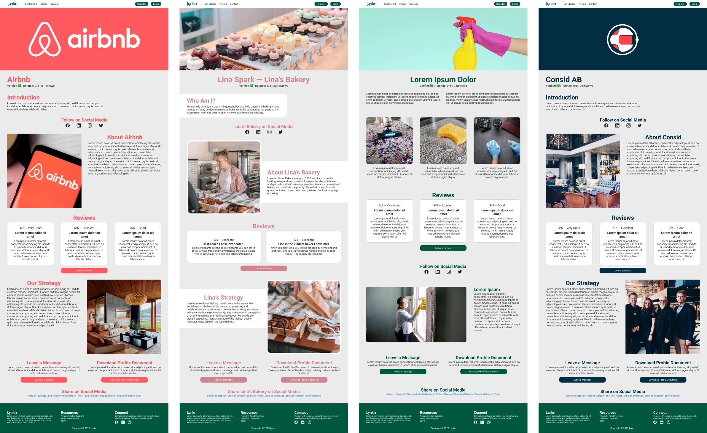
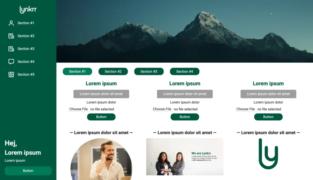
Lynkrr introduced the notion of profiles to allow individuals tell their stories, market skills and bran themselves, with a personal touch. Our solution introduces the balance for the client’s needs.
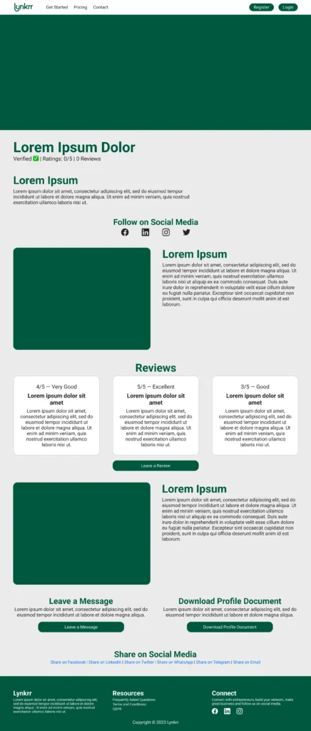
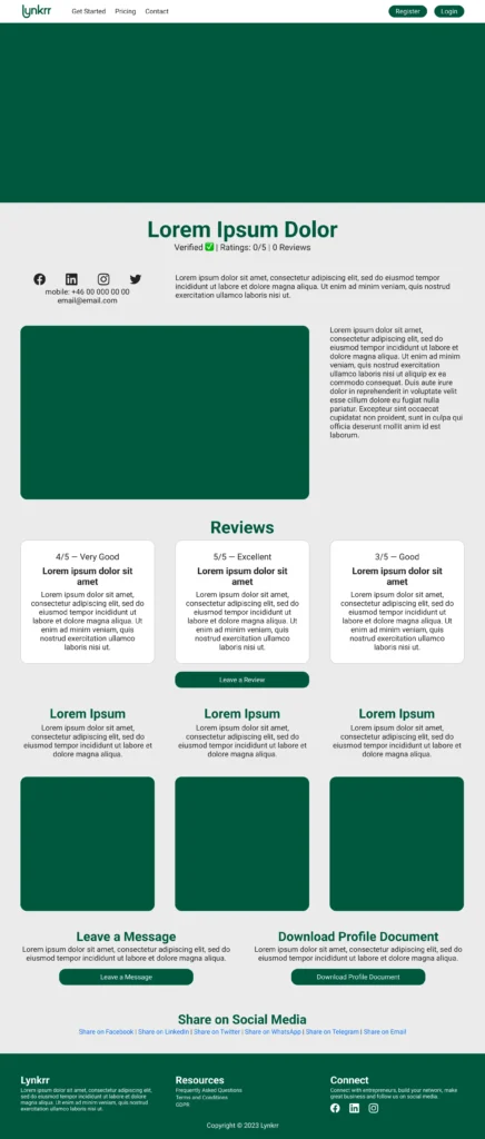
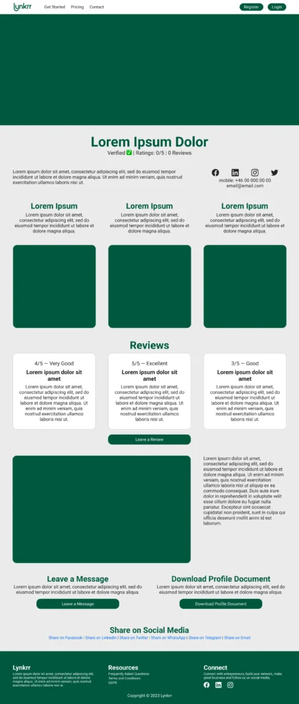
We delivered unique layouts and design propositions to facilitate the varied requirements for text and images. Ideally, we wanted to achieve a cohesive design that is replicated across all the templates and allows for alternation.
Customisation
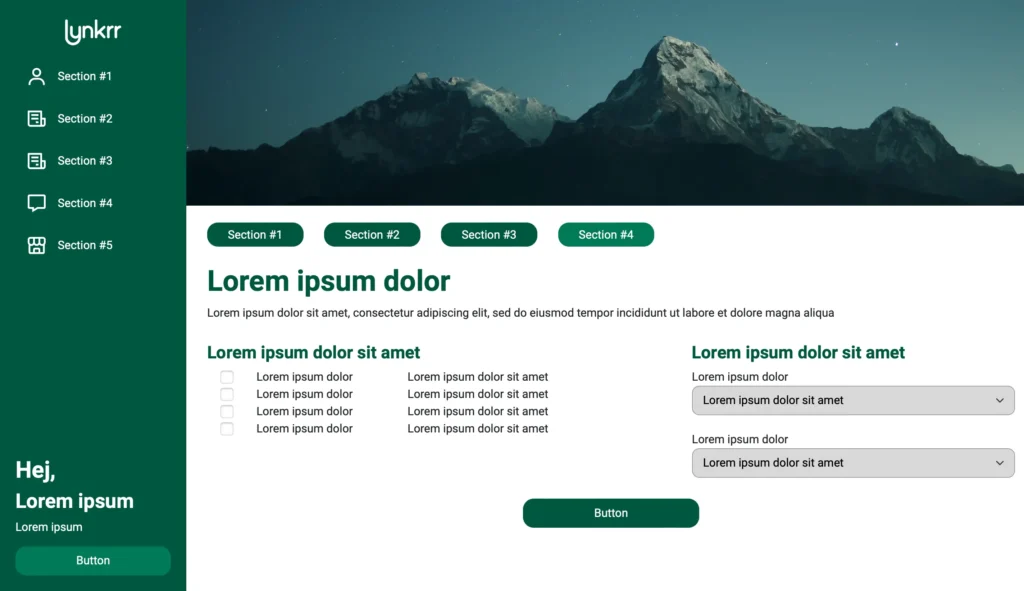
The goal of the customisation is to allow the client to personalise their webpage to the furthest extent possible while still maintaining the Lynkrr identity. We decided to arrange the layout and elements on the pages that follow a unified two and three-column grid. Templates permit the client to align and control the amount of page content.

Dashboard
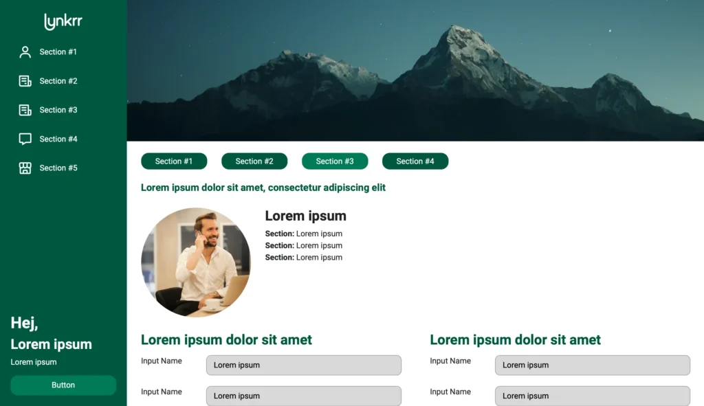
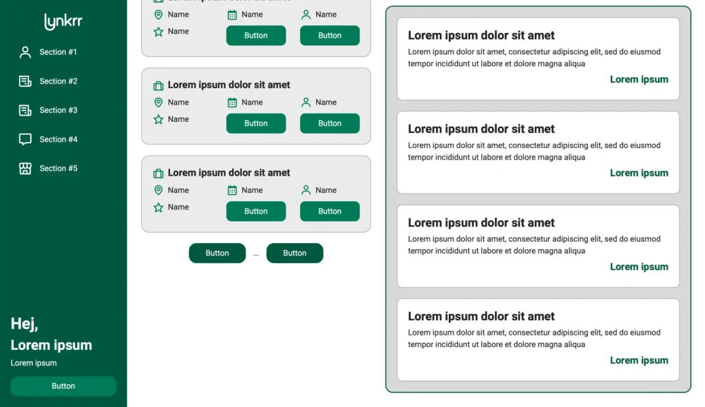
The latest stage of the project focused exclusively on the dashboard and layout optimisation. The dashboard did not need to be responsive for mobile since there would be a separate application for that purpose. Our primary goal with the dashboard was to clean the space up and make it more ordered and understandable for the user.

New Look
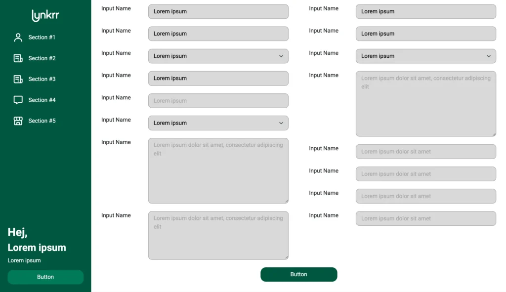
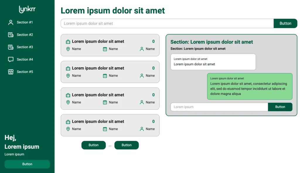
The new dashboard follows the aesthetics of the application’s front end with its layout, touches and functionality. I introduced a secondary green shade to differentiate between different states and bring freshness. The goal was to recreate the former application as closely as possible and to improve the layout to enhance user experience.
Sidebar
Introducing a column layout allows displaying less content simultaneously and follows an information hierarchy. The sidebar is now sticky to reassure the user of his place in the application and permit him to change between tabs. The application considers buttons, search forms, input fields and hovering effects from the front end to support consistency.

Conclusion
The web application, designs, prototypes and guidelines have been handed over to Lynkrr and they are responsible for any visual changes. The application is available only for those in the Lynkrr community. Many details cannot be disclosed as not to breach the privacy.
